Android Control - TabLayout Usage Introduction
2022-02-17 15:15:59
TabLayout
Brief description
TabLayout is a control in Android support android.support.design.widget.TabLayout, Google migrated TabLayout under material package after upgrading AndroidX to com.google. TabLayout, the original tabLayout under support is no longer maintained since API 29. TabLayout is generally used in combination with ViewPager+Fragment to implement a sliding tab selector.
For example, the news tab switch

Take a look at the TabLayout inheritance relationship as follows
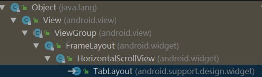
under the support package
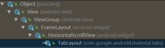
Below the material package
TabLayout inherits from HorizontalScrollView, so it supports left and right sliding, and the following simple example was written to see the effect.
Simple example
activity_tab.xml
TabFragment.java
public class TabFragment extends Fragment {
    public static TabFragment newInstance(String label) {
        Bundle args = new Bundle();
        args.putString("label", label);
        TabFragment fragment = new TabFragment();
        fragment.setArguments(args);
        return fragment;
    }

    @Nullable
    @Override
    public View onCreateView(@NonNull LayoutInflater inflater, @Nullable ViewGroup container, @Nullable Bundle savedInstanceState) {
        return inflater.inflate(R.layout.fragment_tab, container, false);
    }

    @Override
    public void onStart() {
        super.onStart();
        String label = getArguments().getString("label");
        TextView text = getView().findViewById(R.id.tv_bg);
        text.setText(label);
        text.setBackgroundColor(Color.rgb((int)(Math.random() * 255), (int)(Math.random() * 255), (int)(Math.random() * 255))));
    }
}
TabFragment has one TextView in it, and the TextView in each Fragment is given a different text and background color to distinguish which Fragment is current.
fragment_tab.xml
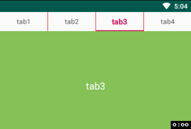
public class TabActivity extends AppCompatActivity {
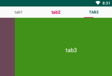
private String[] tabs = {"tab1", "tab2", "tab3"};
private List
简单的3步:
为TabLayout添加tab
给ViewPager设置adapter
设置TabLayout和ViewPager联动
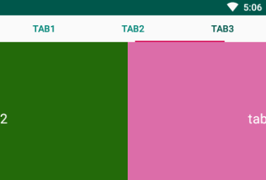
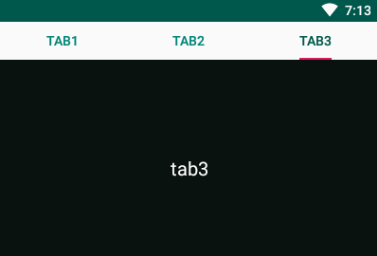
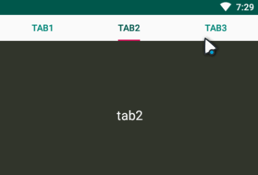
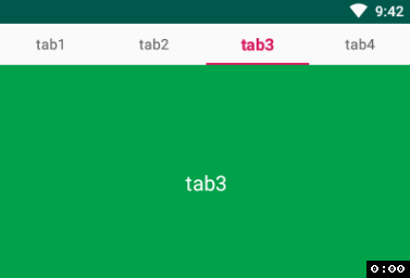
看看运行结果:
好了,基本的功能已经实现了。这里有个需要注意的点:
就是在给ViewPager设置Adapter的时候,一定要重写getPageTitle(int position)方法,不然TabLayout中的标签是看不到的,即使在addTab时newTab().setText(tabs[i])也没用。原因很简单,是在tabLayout.setupWithViewPager的时候,TabLayout中先将所有tabs remove了,然后取的PagerAdapter中的getPageTitle返回值添加的tab。看下源码
@ViewPager.DecorView
public class TabLayout extends HorizontalScrollView {
...
private void setupWithViewPager(
@Nullable final ViewPager viewPager, boolean autoRefresh, boolean implicitSetup) {
if (viewPager != null) {
this.viewPager = viewPager;
...
final PagerAdapter adapter = viewPager.getAdapter();
if (adapter != null) {
// Now we'll populate ourselves from the pager adapter, adding an observer if
// autoRefresh is enabled
setPagerAdapter(adapter, autoRefresh);
}
...
} else {
// We've been given a null ViewPager so we need to clear out the internal state,
// listeners and observers
this.viewPager = null;
setPagerAdapter(null, false);
}
}
void setPagerAdapter(@Nullable final PagerAdapter adapter, final boolean addObserver) {
...
// Finally make sure we reflect the new adapter
populateFromPagerAdapter();
}
void populateFromPagerAdapter() {
removeAllTabs();
if (pagerAdapter != null) {
final int adapterCount = pagerAdapter.getCount();
for (int i = 0; i < adapterCount; i++) {
addTab(newTab().setText(pagerAdapter.getPageTitle(i)), false);
}
...
}
}
...
}
可以看到populateFromPagerAdapter方法中执行了removeAllTabs()方法,然后取pagerAdapter.getPageTitle(i)方法返回值重新添加tab,所以记得重写getPageTitle方法。
除了在代码里面动态的添加tab,还可以直接在xml中进行添加TabItem。
 TabLayout属性介绍
TabLayout有很多属性可以供我们使用,下面简单介绍几个。
tabIndicatorFullWidth
上面的运行结果可以看到指示器的整个宽度是充满屏幕的,有时项目需要指示器线条的宽度和文字得宽度一致,那么就可以设置tabIndicatorFullWidth属性为false,默认为true
TabLayout属性介绍
TabLayout有很多属性可以供我们使用,下面简单介绍几个。
tabIndicatorFullWidth
上面的运行结果可以看到指示器的整个宽度是充满屏幕的,有时项目需要指示器线条的宽度和文字得宽度一致,那么就可以设置tabIndicatorFullWidth属性为false,默认为true
 tabRippleColor
默认点击每一个tab的时候,会出现渐变的背景色
tabRippleColor
默认点击每一个tab的时候,会出现渐变的背景色
如果想要去掉这个点击时的背景,可以通过设置tabRippleColor属性值为一个透明的背景色就可以了
tabTextAppearance
有时候如果设计师需要我们实现,选中的tab文字字体加粗并放大字号,但是TabLayout并没有直接设置字体大小样式的属性,这时候就可以通过设置自定义属性tabTextAppearance来实现,其值是一个自定义style。
- 16sp
- bold
可以看到所有的tab字体都变了,不是我们想要的效果。TabLayout可以设置OnTabSelectedListener监听事件,可以通过选中状态的改变来动态的设置tab样式。下面看看具体的实现逻辑
创建一个tab_text_layout.xml
- 16sp
- bold
- @color/colorAccent
- 14sp
- normal
- @color/grey
tabLayout.addOnTabSelectedListener(new TabLayout.OnTabSelectedListener() {
@Override
public void onTabSelected(TabLayout.Tab tab) {
View customView = tab.getCustomView();
if (customView == null) {
tab.setCustomView(R.layout.tab_text_layout);
}
TextView textView = tab.getCustomView().findViewById(android.R.id.text1);
textView.setTextAppearance(TabActivity.this, R.style.TabLayoutTextSelected);
}
@Override
public void onTabUnselected(TabLayout.Tab tab) {
View customView = tab.getCustomView();
if (customView == null) {
tab.setCustomView(R.layout.tab_text_layout);
}
TextView textView = tab.getCustomView().findViewById(android.R.id.text1);
textView.setTextAppearance(TabActivity.this, R.style.TabLayoutTextUnSelected);
}
@Override
public void onTabReselected(TabLayout.Tab tab) {
}
});
Get the CustomView in the tab, set it to the tab_text_layout we created if it is empty, then find the id of the textView, and finally set the TextAppearance property for the textView.
What we need to notice here is that the id of the textView must be
android.R.id.text1
as you can see from the source code that CustomView gets android.R.id.text1.
public class TabLayout extends HorizontalScrollView {
...
public final class TabView extends LinearLayout {
...
final void update() {
final Tab tab = this.tab;
final View custom = tab ! = null ? tab.getCustomView() : null;
...
customTextView = custom.findViewById(android.R.id.text1);
...
}
}
}
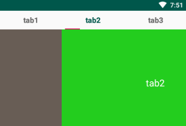
Once everything is modified, re-run it and see the result.
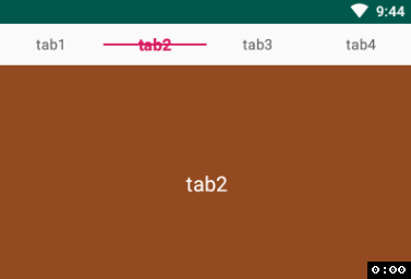
It seems to have an effect, but there is still a little problem, the first time you go in the unselected tab or use the default style, our custom style did not take effect, the reason is that the unselected tab does not perform to the OnTabSelectedListener in the onTabUnselected method. The solution is to simply set an initial TabLayoutTextUnSelected style to the tabTextAppearance property of the TabLayout control.
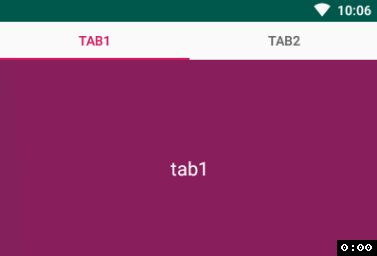
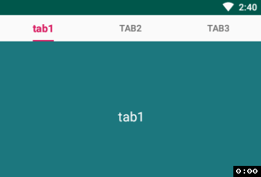
And then look at the effect.
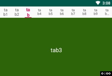
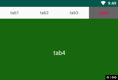
tabMode
The tabMode attribute is used to set whether the tab can be scrolled horizontally or not. The optional values are fixed (default), auto, and scrollable.
In order to see a more obvious contrast, a few more tabs are added here, and when the default fixed is set, all the tabs are squeezed onto the screen
When setting scrollable
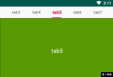
Generally use fixed when there are few tabs and scrollable when there are many tabs, depending on the project.
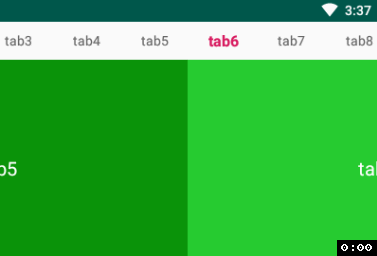
tabIndicatorColor
This is the attribute that sets the color of the indicator line, nothing much to say about it
tabIndicatorHeight
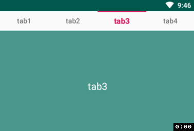
This property sets the height of the indicator, or if we don't need to display the indicator, we can do so by setting the tabIndicatorHeight equal to 0
tabIndicatorGravity
This property sets the display position of the indicator, with optional values of bottom (default), center, top, and stretch.
bottom
center
top
stretch
There are a few other attributes that go to
official website
for more information.
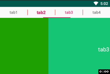
Set the spacing drawable for the TabLayout
TabLayout by default has no spacing between each tab, in real projects you may need to set a small vertical line between each tab or something, so you can do that with the following method.
LinearLayout linearLayout = (LinearLayout) tabLayout.getChildAt(0);
linearLayout.setShowDividers(LinearLayout.SHOW_DIVIDER_MIDDLE);
linearLayout.setDividerDrawable(ContextCompat.getDrawable(this,
R.drawable.layout_divider_vertical));
layout_divider_vertical.xml
 You can see that the height of the line fills the entire TabLayout, and if we need to make the line height shorter, we can set the DividerPadding to do so.
LinearLayout linearLayout = (LinearLayout) tabLayout.getChildAt(0);
linearLayout.setDividerPadding(10);
The result of the run is as follows.
 Well, that's it for the basic use of TabLayout. Please point out any mistakes in the article!
I used
hexo
to build a blog of my own
https://xiayunquan.gitee.io
Well, that's it for the basic use of TabLayout. Please point out any mistakes in the article!
I used
hexo
to build a blog of my own
https://xiayunquan.gitee.io
The category, tagging and search features make it possible to better manage and access articles without having to look at annoying ads.
I'll keep updating my personal blog and CSDN in parallel in the future.
public class TabFragment extends Fragment {
public static TabFragment newInstance(String label) {
Bundle args = new Bundle();
args.putString("label", label);
TabFragment fragment = new TabFragment();
fragment.setArguments(args);
return fragment;
}
@Nullable
@Override
public View onCreateView(@NonNull LayoutInflater inflater, @Nullable ViewGroup container, @Nullable Bundle savedInstanceState) {
return inflater.inflate(R.layout.fragment_tab, container, false);
}
@Override
public void onStart() {
super.onStart();
String label = getArguments().getString("label");
TextView text = getView().findViewById(R.id.tv_bg);
text.setText(label);
text.setBackgroundColor(Color.rgb((int)(Math.random() * 255), (int)(Math.random() * 255), (int)(Math.random() * 255))));
}
}
関連
-
Android プロジェクト コンパイル時に com.android.builder.internal.aapt.v2.Aapt2Exception に遭遇しました。AAPT2 エラー: 詳細はログを確認してください。
-
ADB接続エラーです。ADBサーバーがACKしなかった
-
ADBサーバーがACKしない問題を解決 (pro-test)
-
Android ARTランタイムのDalvik仮想マシンをシームレスに置き換えるプロセスの分析
-
AndroidManifest.xml は、アプリが Google 検索でインデックス化されていないことを警告しています。
-
Android Studioで「Error:SSL peer shut down incorrectly」というエラーが表示される。
-
AndroidのEditTextにデフォルト値を設定する方法とヒントを設定する方法
-
Androidのレイアウトにおけるmarginとpaddingの違いについて
-
アンドロイドプログレスバー自定义
-
Android統計チャート MPAndroidChart
最新
-
nginxです。[emerg] 0.0.0.0:80 への bind() に失敗しました (98: アドレスは既に使用中です)
-
htmlページでギリシャ文字を使うには
-
ピュアhtml+cssでの要素読み込み効果
-
純粋なhtml + cssで五輪を実現するサンプルコード
-
ナビゲーションバー・ドロップダウンメニューのHTML+CSSサンプルコード
-
タイピング効果を実現するピュアhtml+css
-
htmlの選択ボックスのプレースホルダー作成に関する質問
-
html css3 伸縮しない 画像表示効果
-
トップナビゲーションバーメニュー作成用HTML+CSS
-
html+css 実装 サイバーパンク風ボタン
おすすめ
-
Android プロジェクトのライブラリに armeabi-v7a、armeabi、x86 が追加されました。
-
BindView 問題 NULLオブジェクト参照で仮想メソッド 'void android ...' を呼び出そうとする
-
AndroidStudioは、新しいプロジェクト:エミュレータを作成した後、エラーを報告します。ERROR: x86 emulation currently requires hardware acceleration!
-
解決 仮想メソッド '...' を呼び出そうとした。ListAdapter' を null オブジェクトの参照で呼び出そうとした。
-
Android 開発の問題 - いくつかのプロジェクトはすでにワークスペースに存在するため、インポートできません。
-
AndroidでSPAN_EXCLUSIVE_EXCLUSIVEスパンが長さ0にできない場合、EditTextでコンテンツを削除する
-
指定された子にはすでに親がいます。まず、その子の親に対して removeView() をコールする必要があります。
-
オーディオとビデオを再生するための資産と生でAndroidの練習
-
Androidの模倣QQのログインインターフェイスの例、ログインと登録機能を実現するために。
-
android studioエミュレータの起動に失敗しました