Android ProgressBar解説 ProgressBarの色を変更する
2022-02-17 12:01:27
今日はProgressBarについてお話しましょう。
前回までは、プロジェクトの他の人が書いたものを使っていましたが、この2つにはあまり目を向けていませんでした。
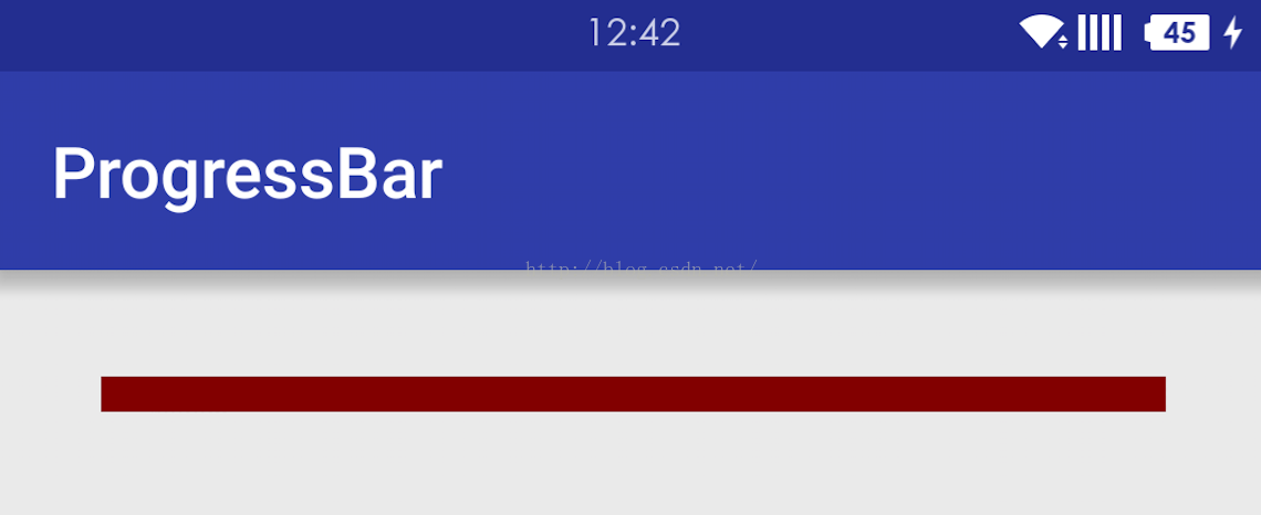
ProgressBarはシンプルなプログレスバーです。
デフォルトでは、円形です。
が、もう一つの横棒の形
また、知る必要があるのは
1. ProgressBar の水平方向の形状は、動画の精度を示すために、現在の再生用とダウンロード用の 2 つのプログレスバーを持っています。
2. ProgressBarは、定型と不定に分かれています。
android:indeterminateは不定型の場合はtrueになります。
3. ProgressBarのシステムのStyleは。
- style="?android:attr/progressBarStyle"
- <スパン style="?android:attr/progressBarStyleHorizontal"
- <スパン style="?android:attr/progressBarStyleInverse"
- <スパン style="?android:attr/progressBarStyleLarge"
- <スパン style="?android:attr/progressBarStyleLargeInverse"
- <スパン style="?android:attr/progressBarStyleSmall"
- <スパン style="?android:attr/progressBarStyleSmallInverse"
- <スパン style="?android:attr/progressBarStyleSmallTitle"
ProgressBarのスタイルを設定するには、2つの方法があります。
<スパン
1.
style="@style/StyleProgressBarMini"
2.
style="?android:attr/progressBarStyleLargeInverse"
上記のどちらの方法でも、PogressBarのプロパティを設定することができます。
ProgressBarをカスタマイズする場合は、一般的に最初のものを使用します。
AndroidのProgressBarのデフォルトの2つのスタイルを見てみましょう。
<style name="Widget.ProgressBar">
    <item name="indeterminateOnly">true</item>
    <item name="indeterminateDrawable">@drawable/progress_medium_white</item>
    <item name="indeterminateBehavior">repeat</item>
    <item name="indeterminateDuration">3500</item>
    <item name="minWidth">48dip</item>
    <item name="maxWidth">48dip</item>
    <item name="minHeight">48dip</item>
    <item name="maxHeight">48dip</item>
    <item name="mirrorForRtl">false</item>
</style>
<style name="Widget.ProgressBar.Horizontal">
    <item name="indeterminateOnly">false</item>
    <item name="progressDrawable">@drawable/progress_horizontal</item>
    <item name="indeterminateDrawable">@drawable/progress_indeterminate_horizontal</item>
    <item name="minHeight">20dip</item>
    <item name="maxHeight">20dip</item>
    <item name="mirrorForRtl">true</item>
</style>
これは、水平方向のProgressBarのStyleです。
progressDrawable このプロパティは、定義されたプログレスバーのプロパティである。
indeterminateDrawable これは不定期プログレスバーの馴れ合いです
システムデフォルトの@drawable/progress_horizontalを見ることができます。
<layer-list xmlns:android="http://schemas.android.com/apk/res/android">

    <item android:id="@android:id/background">
        <shape>
            <corners android:radius="5dip" />
            <gradient
                    android:startColor="#ff9d9e9d"
                    android:centerColor="#ff5a5d5a"
                    android:centerY="0.75"
                    android:endColor="#ff747674"
                    android:angle="270"
            />
        </shape>
    </item>

    <item android:id="@android:id/secondaryProgress">
        <clip>
            <shape>
                <corners android:radius="5dip" />
                <gradient
                        android:startColor="#80ffd300"
                        android:centerColor="#80ffb600"
                        android:centerY="0.75"
                        android:endColor="#a0ffcb00"
                        android:angle="270"
                />
            </shape>
        </clip>
    </item>

    <item android:id="@android:id/progress">
        <clip>
            <shape>
                <corners android:radius="5dip" />
                <gradient
                        android:startColor="#ffffd300"
                        android:centerColor="#ffffb600"
                        android:centerY="0.75"
background、secondProgress、progressの3つの項目があり、その名前から何をするのかが大体わかるので、このファイルをコピーして好きなようにスタイルを変更できる。
次のものは、自分で定義した
<layer-list xmlns:android="http://schemas.android.com/apk/res/android" >

    <! -- background -->
    <item
        android:id="@android:id/background"
        android:drawable="@drawable/progress_patch_green">
    </item>
    <! -- progress -->
    <item android:id="@android:id/progress">
        <clip>
            <nine-patch android:src="@drawable/progress_patch_galy" />
        </clip>
    </item>
    <! -- second progress -->

    <item android:id="@android:id/SecondaryProgress">
        <clip>
            <nine-patch android:src="@drawable/progresspatch_blue" />
        </clip>
    </item>

</layer-list>
上の.9の図の使い方に注意
クリップナインパッチタグについては、今はあまり詳しくないのですが、後日記事を書こうと思います
Drawableの描画を使わず、色だけを使いたい場合はどうすればよいですか?
これを試した。
<layer-list xmlns:android="http://schemas.android.com/apk/res/android">
    <item
        android:id="@android:id/background"
        android:drawable="@color/white">
    </item>
    <item
        android:id="@android:id/secondaryProgress"
        android:drawable="@color/red">
    </item>
    <item
        android:id="@android:id/progress"
        android:drawable="@color/red">
    </item>
</layer-list>
しかし、その後、Progressを設定するとうまくいかず、結果は常に
後日、再挑戦。
<layer-list xmlns:android="http://schemas.android.com/apk/res/android">
    <item
        android:id="@android:id/background"
        >
        <shape>
            <solid android:color="@color/white"></solid>
        </shape>

    </item>
    <item
        android:id="@android:id/secondaryProgress"
        >
        <shape>
            <solid android:color="@color/red"></solid>
        </shape>

    </item>
    <item
        android:id="@android:id/progress"
        >
        <shape>
            <solid android:color="@color/red"></solid>
        </shape>

    </item>
</layer-list>
<スパン まだ動作しない 上記と同じ
後日、もう一度試してみました。
<layer-list xmlns:android="http://schemas.android.com/apk/res/android">
    <item
        android:id="@android:id/background"
        >
        <clip>
            <shape>
                <solid android:color="@color/white"></solid>
            </shape>

        </clip>
    </item>
    <item
        android:id="@android:id/secondaryProgress"
        >
        <clip>
            <shape>
                <solid android:color="@color/red"></solid>
            </shape>

        </clip>
    </item>
    <item
        android:id="@android:id/progress"
        >
        <clip>
            <shape>
                <solid android:color="@color/red"></solid>
            </shape>

        </clip>
    </item>
</layer-list>
後日、もう一度試してみました。
<layer-list xmlns:android="http://schemas.android.com/apk/res/android">
    <item android:id="@android:id/background">
        <clip>
            <shape>
                <gradient
                    android:endColor="@color/white"
                    android:startColor="@color/white"/>
            </shape>
        </clip>
    </item>
    <item android:id="@android:id/secondaryProgress">
        <clip>
            <shape>
                <gradient
                    android:endColor="@color/colorPrimary"
                    android:startColor="@color/colorPrimary"/>
            </shape>
        </clip>
    </item>
    <item android:id="@android:id/progress">
        <clip>
            <shape>
                <gradient
                    android:endColor="@color/colorPrimary"
                    android:startColor="@color/colorPrimary"/>
            </shape>
        </clip>
    </item>
</layer-list>
これは、自分で定義したProgressBarのスタイルです。
<style name="StyleProgressBarMini" parent="Widget.AppCompat.ProgressBar;

    <item name="android:maxHeight">50dp</item>
    <item name="android:minHeight">10dp</item>
    <item name="android:indeterminateOnly">false</item>
    <item name="android:indeterminateDrawable">
        @android:drawable/progress_indeterminate_horizontal
    </item>
    <item name="android:progressDrawable">@drawable/shape_progressbar_mini</item>

</style>
具体的な使用方法は以下の通りです。
<スパン
まず、drawable フォルダに、以下のように、新規に: progressbar_circle_1.xml を作成します。
<ProgressBar
    android:id="@+id/pb_progressbar"
    style="@style/StyleProgressBarMini"
    android:layout_width="match_parent"
    android:layout_height="wrap_content"
    android:layout_margin="30dp"
    android:max="100"
    android:progress="50"/>
ok ここにカスタムサークルがあります。
サークルの主な修正点
android:indeterminateDrawableプロパティ
<?xml version="1.0" encoding="utf-8"? >
<rotate xmlns:android="http://schemas.android.com/apk/res/android"
    android:drawable="@drawable/loading" //custom daisy image
    android:fromDegrees="0"
    android:pivotX="50%"
    android:pivotY="50%"
    android:toDegrees="360" >

</rotate>
<style name="mProgress_circle">
    <item name="android:indeterminateDrawable">@drawable/progressbar_circle_1</item>
    <item name="android:minWidth">25dp</item>
    <item name="android:minHeight">25dp</item>
    <item name="android:maxWidth">60dp</item>
    <item name="android:maxHeight">60dp</item>
</style>
コンポーネントで参照される3番目のステップは、次のとおりです。
上記は画像で入力されています android:indeterminateDrawable を定義することもできます。 アニメーション またはカスタマイズ <スパン カラー(形状) を使えば、画像と同じ使い方ができます。
<ProgressBar
    android:id="@+id/progressBar2"
    style="@style/mProgress_circle"
    android:layout_gravity="center_vertical"
    android:layout_width="match_parent"
    android:indeterminateDuration="1200"
    android:layout_height="wrap_content" />
上記は画像で入力されています android:indeterminateDrawable を定義することもできます。 アニメーション またはカスタマイズ <スパン カラー(形状) を使えば、画像と同じ使い方ができます。
アニメーションprogress_circle_loading,xmlを定義します。
<スパン
以下の記事を参照しています。
<animation-list android:oneshot="false"
  xmlns:android="http://schemas.android.com/apk/res/android">
  <item android:duration="100" android:drawable="@drawable/loading_1" />
  <item android:duration="100" android:drawable="@drawable/loading_2" />
  <item android:duration="100" android:drawable="@drawable/loading_3" />
  <item android:duration="100" android:drawable="@drawable/loading_4" />
  <item android:duration="100" android:drawable="@drawable/loading_5" />
  <item android:duration="100" android:drawable="@drawable/loading_6" />
</animation-list>
<item name="android:indeterminateDrawable">@drawable/progress_circle_loading</item>
<rotate xmlns:android="http://schemas.android.com/apk/res/android"
  android:fromDegrees="0"
  android:pivotX="50%"
  android:pivotY="50%"
  android:toDegrees="360" >
  <shape
    android:innerRadiusRatio="3"
    android:shape="ring"
    android:thicknessRatio="8"
    android:useLevel="false" >
    <gradient
      android:centerColor="#FFFFFF"
      android:centerY="0.50"
      android:endColor="#1E90FF"
      android:startColor="#000000"
      android:type="sweep"
      android:useLevel="false" />
  </shape>
</rotate>
<item name="android:indeterminateDrawable">@drawable/progress_circle_shape</item>
seekBarのカスタマイズは、基本的にProgressBarと同じです。
OK 正直なところ、私はこのグラデーションシェイプに関する新しい知識についてよく知らないので、後で特別な記事を書くことにします。
関連
-
Androidでコンストラクタのインテントを解決できない原因と解決策
-
com.android.ide.common.process.ProcessException が発生する可能性のある原因。aaptの実行に失敗したエラー(解決済み)
-
Error:Execution failed for task ':app:compileDebugJavaWithJavac' 根本的な解決方法
-
Android studio java ファイル表示 j burst red
-
SolutionMethod がスーパークラスのメソッドをオーバーライドしない。
-
Android LayoutInflaterの原則の分析は、ビュー(a)のステップの深い理解によってあなたのステップを取る
-
Android ConstraintLayout コンストレイントレイアウト
-
Android Studioの設定 Gradleの概要
-
Android TextViewは、あるテキストのカラー・フォント・サイズを設定する
-
android.view.inflateexception バイナリ xml ファイル行例外の解決方法
最新
-
nginxです。[emerg] 0.0.0.0:80 への bind() に失敗しました (98: アドレスは既に使用中です)
-
htmlページでギリシャ文字を使うには
-
ピュアhtml+cssでの要素読み込み効果
-
純粋なhtml + cssで五輪を実現するサンプルコード
-
ナビゲーションバー・ドロップダウンメニューのHTML+CSSサンプルコード
-
タイピング効果を実現するピュアhtml+css
-
htmlの選択ボックスのプレースホルダー作成に関する質問
-
html css3 伸縮しない 画像表示効果
-
トップナビゲーションバーメニュー作成用HTML+CSS
-
html+css 実装 サイバーパンク風ボタン
おすすめ
-
Androidでの録音とMP3へのローカルトランスコード
-
第20章 OnCheckedChangeListenerイベント (ゼロから学ぶAndroid)
-
警告: 構成 'compile' は廃止され、'implementation' と 'api' に置き換わりました。
-
ADBサーバーがACKしない問題を解決 (pro-test)
-
Android Studioの解決策:xxxは囲むクラスではありませんエラー
-
Solve アクティビティのメソッドを実行できませんでした
-
エミュレータです。PANIC: AVDのシステムパスが壊れています。ANDROID_SDK_ROOTの値を確認してください。
-
android.content.res.Resources$NotFoundException: 文字列リソースID #0x1 Sinkhole!
-
AndroidManifestのuses-permissionの設定
-
Android 問題その9:AVD フォルダにコピーする ABI armeabi 用の 'userdata.img' ファイルが見つからない。