Androidデザインサポートライブラリ使用方法詳細
Androidデザインサポートライブラリ使用方法詳細
GoogleはIO2015でより詳細なMaterial Designのデザイン仕様と、新しいAndroid Design Support Libraryをもたらし、その中でGoogleはより標準化されたMDデザインスタイルのコントロールを私たちに提供しました。最も重要なことは、Android Design Support Libraryがより広く互換性を持ち、Android 2.2に直接後方互換性があることです。
サポートライブラリの使い方はとても簡単です。
参照を追加するだけです。
compile 'com.android.support:design:22.2.0'
これらの新しいコントロールの基本的な使い方を見てみましょう。まずは一番簡単なものから。
のAndroid Developer Blogから直接引用している内容もあります。
英語原文です。
http://android-developers.blogspot.jp/2015/05/android-design-support-library.html
パイナップルの翻訳。
http://www.jcodecraeer.com/a/anzhuokaifa/developer/2015/0531/2958.html
スナックバー
Snackbar は Toast と AlertDialog の間に位置する軽量なコントロールで、メッセージに対するアラートとアクションのフィードバックを簡単に提供することができます。
Snackbarの使い方は、Toastとほぼ同じです。
Snackbar.make(view, "Snackbar comes out", Snackbar.LENGTH_LONG)
                        .setAction("Action", new View.OnClickListener() {
                            @Override
                            public void onClick(View v) {
                                Toast.makeText(
                                        MainActivity.this,
                                        "Toast comes out",
                                        Toast.LENGTH_SHORT).show();
                            }
                        }).show();
ここでは、最初のパラメータをスナックバー表示のベース要素として使用しており、セットアクションは複数回設定することができることに注意してください。
このような表示になります。
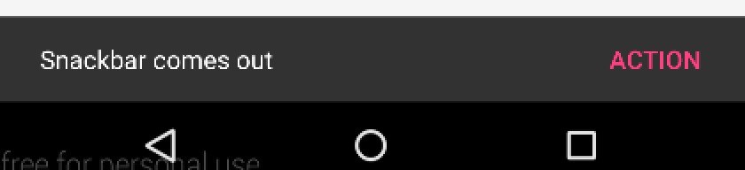
SnackbarはToastと同じように一定時間経過すると消えます。
Google公式API Docの説明です。
http://developer.android.com/reference/android/support/design/widget/Snackbar.html
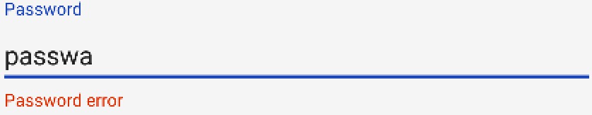
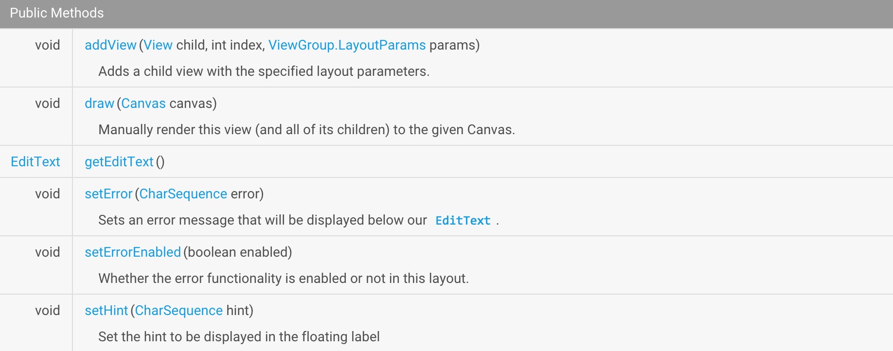
テキスト入力レイアウト
TextInputLayout は、新しい EditText をラップする親コンテナコントロールとして動作します。通常、別の EditText はユーザーが最初の文字を入力した後にヒントメッセージを隠しますが、TextInputLayout を使って EditText をラップし、ヒントメッセージは EditText の上に表示されるフローティングラベルになり、ユーザーが最初の文字を入力するとヒントは隠れるようになりました。また、EditTextにリスナーを追加すれば、さらにフローティングラベルを追加することができます。
ここでは、TextInputLayoutで見てみましょう。
<android.support.design.widget.TextInputLayout
        android:id="@+id/til_pwd"
        android:layout_width="match_parent"
        android:layout_height="wrap_content">

        <EditText
            android:layout_width="match_parent"
            android:layout_height="wrap_content"/>

</android.support.design.widget.TextInputLayout>
EditTextを含めているため、単独では使用できないことに注意。
コードでは、listen toに設定しています。
        final TextInputLayout textInputLayout = (TextInputLayout) findViewById(R.id.til_pwd);

        EditText editText = textInputLayout.getEditText();
        textInputLayout.setHint("Password");

        editText.addTextChangedListener(new TextWatcher() {
            @Override
            public void beforeTextChanged(CharSequence s, int start, int count, int after) {
                if (s.length() > 4) {
                    textInputLayout.setError("Password error");
                    textInputLayout.setErrorEnabled(true);
                } else {
                    textInputLayout.setErrorEnabled(false);
                }
            }

            @Override
            public void onTextChanged(CharSequence s, int start, int before, int count) {
            }

            @Override
            public void afterTextChanged(Editable s) {
            }
        });
    }
こうすると:このように表示されます。
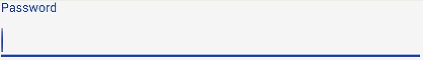
入力時
ここで、TextInputLayoutの色は、スタイル内のcolorAccentの色からきていることに注意してください。
<item name="colorAccent">#1743b7
TextInputLayoutの詳しい使い方は、Google API Docに記載されているので、そちらを参照してください。
http://developer.android.com/reference/android/support/design/widget/TextInputLayout.html
フローティングアクションボタン
デザインライブラリのfloatingActionButtonは、このようにテーマのデフォルト色であるcolorAccentでフローティングアクションボタンを実装しています。
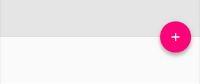
FloatingActionButton - FABの使い方はとても簡単で、後で紹介する拡張FrameLayout - CoordinatorLayoutの中で指定することができます .
FABの使い方については、ボタンとして扱えばいいだけです。
<android.support.design.widget.FloatingActionButton
        android:id="@+id/fab"
        android:layout_width="wrap_content"
        android:layout_height="wrap_content"
        android:layout_gravity="end|bottom"
        android:layout_margin="@dimen/fab_margin"
        android:src="@drawable/ic_done"/>
layout_gravityを指定することで、その位置を指定することができる。
同様に、表示位置のアンカーポイントであるアンカーを指定することで、表示位置を指定することができます。
<android.support.design.widget.FloatingActionButton
        android:layout_height="wrap_content"
        android:layout_width="wrap_content"
        app:layout_anchor="@id/app_bar"
        app:layout_anchorGravity="bottom|right|end"
        android:src="@android:drawable/ic_done"
        android:layout_margin="15dp"
        android:clickable="true"/>
通常サイズのホバーアクションボタンに加え、ミニサイズ(fabSize="mini")にも対応しています。floatingActionButtonはImageViewを継承しており、FloatingActionButton内のアイコンを設定するには android:src や setImageDrawable() などの ImageViewメソッドを使用することが可能です。
http://developer.android.com/reference/android/support/design/widget/FloatingActionButton.html
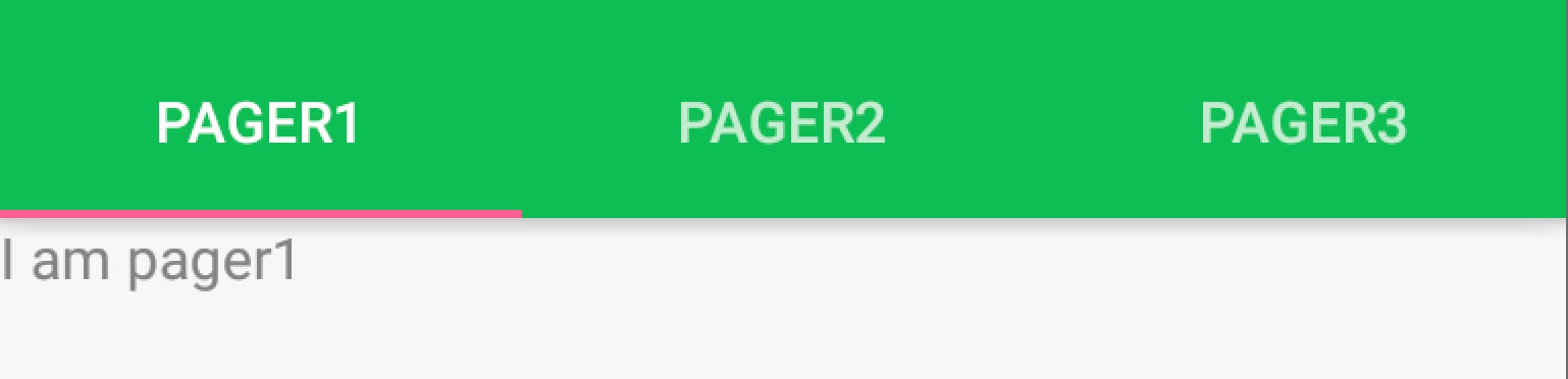
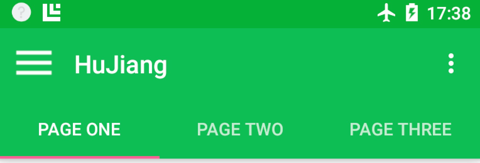
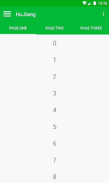
タブレイアウト
タブのスライド式トグルViewは新しいコンセプトではありませんが、Googleはサポートライブラリで初めてフルサポートし、DesignライブラリのTabLayoutは、固定タブ - ビュー幅を均等に分散、およびスクロール可能タブ - ビュー幅が固定されていない、水平スクロールすることができます両方の実装があります。タブは、アプリケーションで動的に追加できます。
        TabLayout tabLayout = (TabLayout) findViewById(R.id.tabs);
        tabLayout.addTab(tabLayout.newTab().setText("tab1"));
        tabLayout.addTab(tabLayout.newTab().setText("tab2"));
        tabLayout.addTab(tabLayout.newTab().setText("tab3"));
しかし、ほとんどの場合、このような使い方はしません。通常、スライドレイアウトはViewPagerと組み合わせて使用するため、ViewPagerの助けが必要なのです。
        mViewPager = (ViewPager) findViewById(R.id.viewpager);
        // Set up the ViewPager's data, etc.
        setupViewPager();
        TabLayout tabLayout = (TabLayout) findViewById(R.id.tabs);
        tabLayout.setupWithViewPager(mViewPager);
setupWithViewPagerという一文で、ViewPagerとTabLayoutを合体させました。
http://developer.android.com/reference/android/support/design/widget/TabLayout.html
ナビゲーションビュー
NavigationViewはMDデザインにおいて非常に重要で、以前はGoogleもDrawerLayoutを使ってナビゲーションのドロワーを実装することを提案していました。今回、サポートライブラリでナビゲーションメニューのインターフェイスを実装するために、GoogleはNavigationViewを提供しているので、新しいナビゲーションインターフェイスは以下のように書くことができるようになった。
app:menu
With these two attributes, we can very easily specify the header layout and menu layout of the navigation interface: the
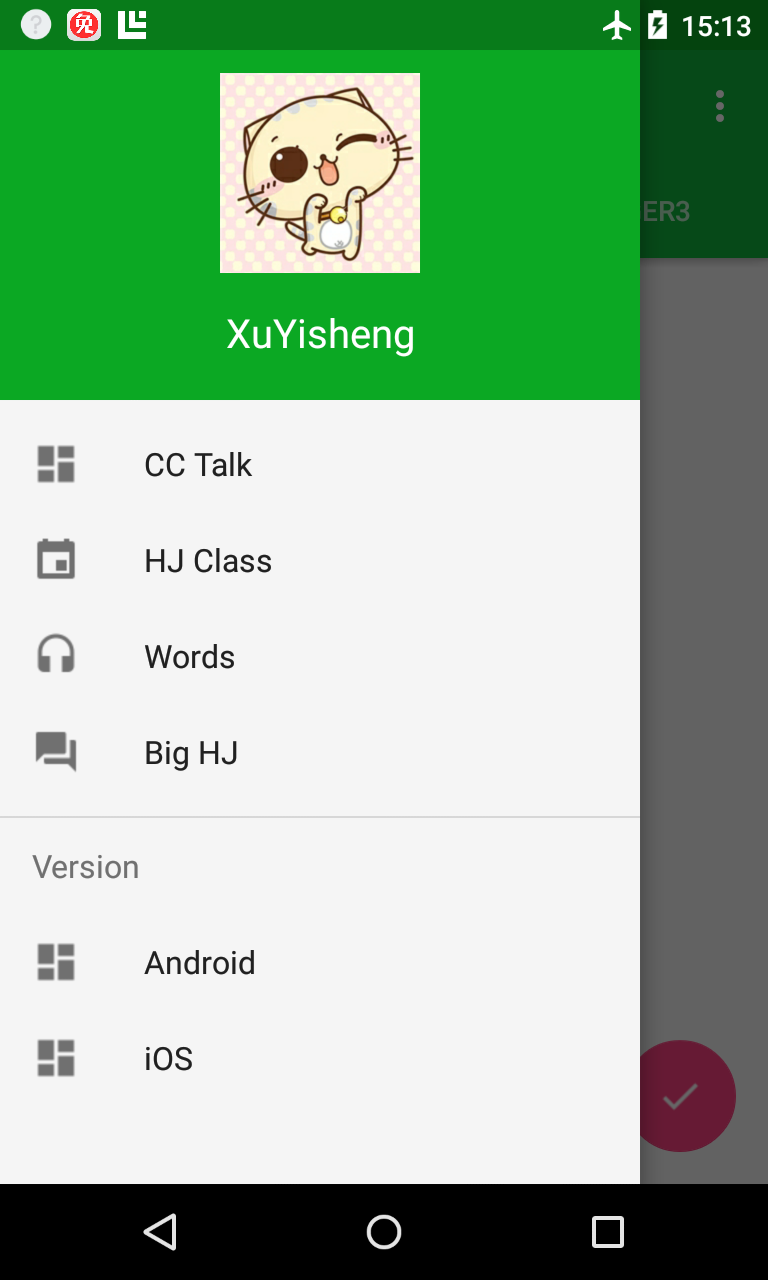 Where the topmost layout is the header layout specified by app:headerLayout: the
private void setupDrawerContent(NavigationView navigationView) {
navigationView.setNavigationItemSelectedListener(
new NavigationView.OnNavigationItemSelectedListener() {
@Override
public boolean onNavigationItemSelected(MenuItem menuItem) {
menuItem.setChecked(true);
mDrawerLayout.closeDrawers();
return true;
}
});
}
As you can see, Google has wrapped these things up to be very easy to use.
AppBarLayout
AppBarLayout does exactly what its name implies, treating all the components of the container class as AppBar. like this.
 Here is where the Toolbar and TabLayout are put into the AppBarLayout, so that they act as one as the AppBar.
<android.support.design.widget.AppBarLayout
android:id="@+id/appbar"
android:layout_width="match_parent"
android:layout_height="wrap_content"
android:theme="@style/ThemeOverlay.AppCompat.Dark.ActionBar">
<android.support.v7.widget.Toolbar
android:id="@+id/toolbar"
android:layout_width="match_parent"
android:layout_height="?attr/actionBarSize"
android:background="?attr/colorPrimary"
app:popupTheme="@style/ThemeOverlay.AppCompat.Light"/>
<android.support.design.widget.TabLayout
android:id="@+id/tabs"
android:layout_width="match_parent"
android:layout_height="wrap_content"/>
</android.support.design.widget.AppBarLayout>
http://developer.android.com/reference/android/support/design/widget/AppBarLayout.html
CoordinatorLayout
The CoordinatorLayout is a new and enhanced FrameLayout, and in the CoordinatorLayout we can do a lot of new things on top of the FrameLayout.
Floating View
One of the new features of MD is the addition of many hoverable Views, like the Floating Action Button we talked about earlier. we can put the FAB anywhere, just by.
android:layout_gravity="end|bottom"
to specify the position of the display. It also provides the layout_anchor for you to set the anchor point for the display coordinates.
app:layout_anchor="@id/appbar"
Create scrolling
CoordinatorLayout is arguably the most important part of this support library update. It goes to another level to control the layout of touch events between child views, and many of the controls in the design library make use of it.
A good example is when you add the FloatingActionButton as a child view to the CoordinatorLayout and pass the CoordinatorLayout to Snackbar.make(), on devices 3.0 and above, the Snackbar does not appear on top of the hover button Instead, the FloatingActionButton uses the callback method provided by the CoordinatorLayout to automatically move up when the Snackbar animates in and return to its original position when the Snackbar animates out, with no additional code required.
The official example illustrates this nicely.
<android.support.design.widget.CoordinatorLayout
xmlns:android="http://schemas.android.com/apk/res/android"
xmlns:app="http://schemas.android.com/apk/res-auto"
android:layout_width="match_parent"
android:layout_height="match_parent">
<! -- Your Scrollable View -->
<android.support.v7.widget.RecyclerView
android:layout_width="match_parent"
android:layout_height="match_parent"
app:layout_behavior="@string/appbar_scrolling_view_behavior" />
<android.support.design.widget.AppBarLayout
android:layout_width="match_parent"
android:layout_height="wrap_content">
<android.support.v7.widget.
...
app:layout_scrollFlags="scroll|enterAlways">
<android.support.design.widget.
...
app:layout_scrollFlags="scroll|enterAlways">
</android.support.design.widget.AppBarLayout>
</android.support.design.widget.CoordinatorLayout>
Where a component that can scroll, such as a RecyclerView, ListView (
Note here that it seems that only RecyclerView, ListView are supported, if you use a ScrollView, it won't work
). If.
1. set the layout_behavior for this scrollable component
2. set the layout_scrollFlags for another control
Then, when the control with layout_behavior set slides, it will trigger a state change for the control with layout_scrollFlags set.
 The set layout_scrollFlags have the following options.
scroll: All views that want to scroll out of the screen need to have this flag set - views that don't have this flag set will be fixed at the top of the screen.
enterAlways: This flag makes any downward scrolling cause the view to become visible, enabling fast "back mode".
enterAlwaysCollapsed: When your view has the minHeight property set and this flag is used, your view can only be entered at its minimum height, and only expands to its full height when the scrolled view reaches the top.
exitUntilCollapsed: This flag causes the view to scroll off until it is 'collapsed' (its minHeight) before exiting.
Note that the last two modes are basically only useful in CollapsingToolbarLayout, while the first two modes are basically required to be used together, meaning that the scenario for using these flags is, basically, fixed.
The set layout_scrollFlags have the following options.
scroll: All views that want to scroll out of the screen need to have this flag set - views that don't have this flag set will be fixed at the top of the screen.
enterAlways: This flag makes any downward scrolling cause the view to become visible, enabling fast "back mode".
enterAlwaysCollapsed: When your view has the minHeight property set and this flag is used, your view can only be entered at its minimum height, and only expands to its full height when the scrolled view reaches the top.
exitUntilCollapsed: This flag causes the view to scroll off until it is 'collapsed' (its minHeight) before exiting.
Note that the last two modes are basically only useful in CollapsingToolbarLayout, while the first two modes are basically required to be used together, meaning that the scenario for using these flags is, basically, fixed.
For example, in our previous example, this is the same pattern.
app:layout_scrollFlags="scroll|enterAlways"
PS : All views that use a scroll flag must be defined in front of views that do not use a scroll flag, to ensure that all views exit from the top, leaving fixed elements.
http://developer.android.com/reference/android/support/design/widget/CoordinatorLayout.html
CollapsingToolbarLayout
CollapsingToolbarLayout provides a collapsible Toolbar, which is also the effect in Google+, photos. google has made it a standard control to make it easier for everyone to use.
Here's an example to start with.
<android.support.design.widget.AppBarLayout
android:id="@+id/appbar"
android:layout_width="match_parent"
android:layout_height="@dimen/detail_backdrop_height"
android:fitsSystemWindows="true"
android:theme="@style/ThemeOverlay.AppCompat.Dark.ActionBar">
<android.support.design.widget.CollapsingToolbarLayout
android:id="@+id/collapsing_toolbar"
android:layout_width="match_parent"
android:layout_height="match_parent"
android:fitsSystemWindows="true"
app:contentScrim="?attr/colorPrimary"
app:expandedTitleMarginEnd="64dp"
app:expandedTitleMarginStart="48dp"
app:layout_scrollFlags="scroll|exitUntilCollapsed">
<ImageView
android:id="@+id/backdrop"
android:layout_width="match_parent"
android:layout_height="match_parent"
android:fitsSystemWindows="true"
android:scaleType="centerCrop"
android:src="@drawable/ic_banner"
app:layout_collapseMode="parallax"/>
<android.support.v7.widget.Toolbar
android:id="@+id/toolbar"
android:layout_width="match_parent"
android:layout_height="?attr/actionBarSize"
app:layout_collapseMode="pin"
app:popupTheme="@style/ThemeOverlay.AppCompat.Light"/>
</android.support.design.widget.CollapsingToolbarLayout>
</android.support.design.widget.AppBarLayout>
We have placed an ImageView and a Toolbar in the CollapsingToolbarLayout and put this CollapsingToolbarLayout into the AppBarLayout as a whole. In the CollapsingToolbarLayout, we set the layout_collapseMode of the ImageView and a Toolbar respectively.
Here the CollapsingToolbarLayout's app:layout_collapseMode="pin" is used to ensure that the Toolbar remains pinned to the top of the screen when the view is collapsed. When you have the CollapsingToolbarLayout and Toolbar working together, the title will automatically become larger when expanded and let the font transition to its default value when collapsed. It is important to note that in this case you must call setTitle() on the CollapsingToolbarLayout, not on the Toolbar.
In addition to holding the view in place, you can use app:layout_collapseMode="parallax" (and app:layout_collapseParallaxMultiplier=" 0.7" to set the parallax factor) to achieve a parallax scrolling effect (such as an ImageView inside a CollapsingToolbarLayout), which is the same as the CollapsingToolbarLayout's app:contentScrim= "?attr/colorPrimary" property.
In this example, we also set.
app:layout_scrollFlags="scroll|exitUntilCollapsed">
to receive a.
app:layout_behavior="@string/appbar_scrolling_view_behavior">
This creates the scrolling effect, and with layout_collapseMode we set the effect of the content changing when scrolling.
 For another official example.
 CoordinatorLayout with custom view
One thing that must be noted is that CoordinatorLayout doesn't know the inner workings of FloatingActionButton or AppBarLayout - it just provides additional API in the form of Coordinator.Behavior that enables child Views to better control touch events and gestures and declare dependencies between them, and receive callbacks via onDependentViewChanged().
You can use the CoordinatorLayout.DefaultBehavior(yourView.Behavior.class) annotation or use the app:layout_behavior="com.example.app.yourView$ The framework makes it possible to combine arbitrary views with CoordinatorLayout.
http://developer.android.com/reference/android/support/design/widget/CollapsingToolbarLayout.html
Summary
After a few days of research, the significance of the Android Design Support Library proposed by Google this time is not really in giving these very good controls, in fact, these controls can basically be found on Github accordingly. Its purpose is that Google has given official design guidance and further improved MD design ideas. This is the most important feature of Android Design Support Library. Of course, to be fair, the use of these controls is not very user-friendly, too much encapsulation leads to the whole effect is not very customizable, but, after all, this is Google's first step, and it will be even more awesome later.
Demo
Finally, a demo that combines MD and Android Design Support Library is given for your study. I believe that with the article and code, you will be able to understand the usage of Android Design Support Library quickly.
DesignSupportLibraryDemo
https://github.com/xuyisheng/DesignSupportLibraryDemo
Welcome to star and fork.
The current version is not yet perfect, and many screens are still being processed. It will be further enriched and improved later, as a demo of MD design.
CoordinatorLayout with custom view
One thing that must be noted is that CoordinatorLayout doesn't know the inner workings of FloatingActionButton or AppBarLayout - it just provides additional API in the form of Coordinator.Behavior that enables child Views to better control touch events and gestures and declare dependencies between them, and receive callbacks via onDependentViewChanged().
You can use the CoordinatorLayout.DefaultBehavior(yourView.Behavior.class) annotation or use the app:layout_behavior="com.example.app.yourView$ The framework makes it possible to combine arbitrary views with CoordinatorLayout.
http://developer.android.com/reference/android/support/design/widget/CollapsingToolbarLayout.html
Summary
After a few days of research, the significance of the Android Design Support Library proposed by Google this time is not really in giving these very good controls, in fact, these controls can basically be found on Github accordingly. Its purpose is that Google has given official design guidance and further improved MD design ideas. This is the most important feature of Android Design Support Library. Of course, to be fair, the use of these controls is not very user-friendly, too much encapsulation leads to the whole effect is not very customizable, but, after all, this is Google's first step, and it will be even more awesome later.
Demo
Finally, a demo that combines MD and Android Design Support Library is given for your study. I believe that with the article and code, you will be able to understand the usage of Android Design Support Library quickly.
DesignSupportLibraryDemo
https://github.com/xuyisheng/DesignSupportLibraryDemo
Welcome to star and fork.
The current version is not yet perfect, and many screens are still being processed. It will be further enriched and improved later, as a demo of MD design.
関連
-
Android Studio + Gradle またはコマンドラインを使用した Android apk の署名とパッケージング
-
Android フロントカメラのビデオ録画に失敗しました (MediaRecorder: start failed: -19)
-
Android 問題集 第42回:INSTALL_FAILED_OLDER_SDK
-
アプリケーションがメインスレッドで過剰に作業している可能性があります。
-
Android マルチメディア MediaPlayerの使用方法詳細
-
Android 高機能版 (xxv) setTextColor() パラメータ設定方法
-
Android画像角丸
-
アクティビティクラス{パッケージ/クラス}が存在しない 原因と解決方法
-
Mac版Android Studioでadb: コマンドが見つからないと表示される
-
Android StudioのFAQとその解決方法
最新
-
nginxです。[emerg] 0.0.0.0:80 への bind() に失敗しました (98: アドレスは既に使用中です)
-
htmlページでギリシャ文字を使うには
-
ピュアhtml+cssでの要素読み込み効果
-
純粋なhtml + cssで五輪を実現するサンプルコード
-
ナビゲーションバー・ドロップダウンメニューのHTML+CSSサンプルコード
-
タイピング効果を実現するピュアhtml+css
-
htmlの選択ボックスのプレースホルダー作成に関する質問
-
html css3 伸縮しない 画像表示効果
-
トップナビゲーションバーメニュー作成用HTML+CSS
-
html+css 実装 サイバーパンク風ボタン
おすすめ
-
Android Studioで「Error:SSL peer shut down incorrectly」というエラーが表示される。
-
BUG: android アクティビティはエクスポートされるか、インテント・フィルタを含む必要があります。
-
android MediaPlayerのエラーコード(エラーコード)まとめ
-
カラーバリューがマイナス
-
アンドロイドのdrawableフォルダ配下の各種xmlスタイルファイルの使用方法について詳しく解説しています
-
android:paddingとandroid:marginの違いについて。
-
android.content.ActivityNotFoundException: Intenを処理するアクティビティが見つからない
-
OnFragmentInteractionListener/ Fragment to Activity, Fragment to Fragment メッセージングを実装する必要があります。
-
ApkToolとdex2jarでapkをデコンパイルする - アップデートによる例外と解決策
-
Android|RadioGroup-デフォルトのチェックを設定する