角丸ボタンのAndroid実装(セレクタとシェイプのシンプルな使い方)
まず最初に、この2日間、何をしたらいいかわからない、何もしたくない、一日中くだらないことを考えている、というような、もやもやした状態が続いていることです。今は春で、もう冬眠は過ぎているのに(ジモは最近ちょっと寒いけど)、自分が何をしているのか、この先どこにいるのかわからない、一種の歩行麻痺からまだ目覚められないのです。
本題に入りますが、今日はAndroidで角丸ボタンを実装するための簡単なデモです。まずは効果を見てみましょう。もし、思い通りにならないと思ったらパスすればいいだけです。
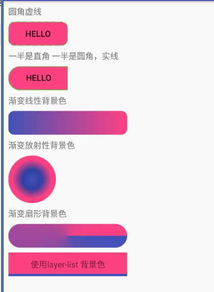
セレクタ
<RelativeLayout xmlns:android="http://schemas.android.com/apk/res/android"
    xmlns:tools="http://schemas.android.com/tools"
    android:layout_width="match_parent"
    android:layout_height="match_parent" >

<! --Note android:background="@drawable/btn_selector"-->

    <Button
        android:id="@+id/Button1"
        android:layout_width="wrap_content"
        android:layout_height="wrap_content"
        android:layout_centerInParent="true"
        android:background="@drawable/btn_selector"
        android:text="@string/hello_world" />

</RelativeLayout>
上のButtonのbackgroundプロパティに注目してください。
android:background="@drawable/btn_selector"
btn_selectorがカスタムxmlファイルである場合、先にこのファイルを見てください。
プロジェクトのresディレクトリにdrawable(小文字英語、書き間違いに注意)という新しいfolderを作成し、drawableディレクトリに新しいセレクタファイルを作成します。
btn_selector.xml
<?xml version="1.0" encoding="utf-8"? >
<selector xmlns:android="http://schemas.android.com/apk/res/android">

    <! -- Background of Button in its normal state -->
    <item android:drawable="@drawable/btn_bg_normal" android:state_pressed="false"/>
    <! -- background when Button is pressed -->
    <item android:drawable="@drawable/btn_bg_pressed" android:state_pressed="true"/>
</selector>
このファイルの内容と意味は、数秒で理解できるはずです ボタンが通常押されていないときは背景を表示し、押されたときは別の色の背景を表示して、ボタンが押されたことをユーザーに知らせるものです。
btn_selector.xmlファイルから、btn_bg_normalとbtn_bg_pressedを見つけることができます。
res/drawable
ディレクトリに格納されます。
btn_bg_normal.xml
<?xml version="1.0" encoding="utf-8"? >
<! -- background when the button is normal -->
<! -- The default shape of shape is rectangle, and oval (ellipse), line (line), ring (circle), I've used rectangle, others you can try -->

<shape xmlns:android="http://schemas.android.com/apk/res/android">
    <!
    <corners android:radius="10dp" />
    <! -- The fill color of the rectangle -->
    <solid android:color="#FF4081" />

    <! -- The width of the rectangle's border, the length of each dotted line, and the color and color between the two dotted lines -->
    <stroke
        android:width="1dp"
        android:dashWidth="8dp"
        android:dashGap="4dp"
        android:color="#4eb621" />
</shape>
btn_bg_pressed.xml
<?xml version="1.0" encoding="utf-8"? >
<shape xmlns:android="http://schemas.android.com/apk/res/android">
    <! -- The arc of the rounded corners of the rectangle -->
    <corners android:radius="10dp" />
    <! -- The fill color of the rectangle -->
    <solid android:color="#3F51B5" />
    <! -- The width of the rectangle's border, the length of each dashed line, and the color and color between the two dashed lines -->
    <stroke
        android:width="1dp"
        android:color="#4eb621"
        android:dashGap="4dp"
        android:dashWidth="8dp" />
</shape>
ストロークがシェイプの境界線であることに注意してください
  <stroke
        android:width="1dp"
        android:dashWidth="8dp"
        android:dashGap="4dp"
        android:color="#4eb621" />
ボーダーラインを破線ではなく実線にしたい場合は、次のように書きます。
<stroke
        android:width="1dp"
        android:color="#4eb621" />
なお、左は角丸、右は角丸だけで同様の背景を実現したい場合は、以下のように設定します。
<corners
                android:topLeftRadius="20dp"
                android:bottomLeftRadius="20dp"
                android:topRightRadius="0dp"
                android:bottomRightRadius="0dp" />
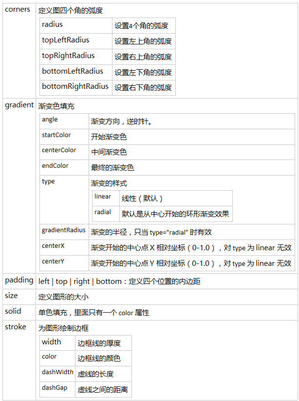
各コーナーの角度を指定する
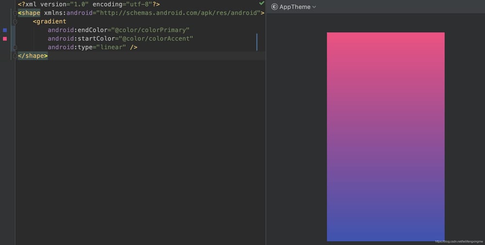
gradient グラデーションの背景色
<gradient
  android:angle="integer"
  android:centerX="Float"
  android:centerY="Float"
  android:centerColor="integer"
  android:startColor="color"
  android:endColor="color"
  android:gradientRadius="integer"
  android:type=["linear"|"radial"|"sweep"]
  android:usesLevel=["true"|"false"]
  />

angle: angle, valid when android:type="linear", the angle number should be a multiple of 45 degrees, rotate counterclockwise
centerX: Float, the X relative position of the center of the gradient (0-1.0). Not valid when android:type="linear".
centerY: Float. Y position of the center of the gradient (0-1.0). Invalid when android:type="linear".
centerColor: color. optional color, appears between start and end color.
gradientRadius: float. radius of the gradient color. Valid when android:type="radial".
startcolor: the color of the start
endcolor: the end color of the gradient.
type: the style of the gradient color. Valid values are.
"linear": linear gradient, default value
"radial": ring gradient. start color is the color in the middle
"sweep": fan gradient
useLevel: Boolean. "true" means it can be used as LevelListDrawable (don't get what it means)
angle
以下は
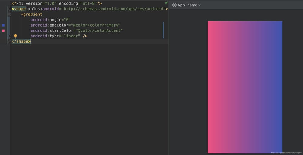
デフォルトの角度は0(startColor-endColorが左から右に変化)ですが、xmlファイルで明示的に0を指定しないと、以下のようにプレビューの角度が正しくならないことがあります。
<?xml version="1.0" encoding="utf-8"? >
<layer-list xmlns:android="http://schemas.android.com/apk/res/android">

    <! -- above is the bottom layer of the background -- >
    <item>
        <shape android:shape="rectangle">
            <solid android:color="@color/colorPrimary" />
        </shape>
    </item>

    <! --text layer above the background Make the bottom background reveal a height of 4dp -->
    <item android:bottom="4dp">
        <shape android:shape="rectangle">
            <solid android:color="@color/colorAccent" />
        </shape>
    </item>
</layer-list>
xmlファイルでデフォルトの角度0を明示的に指定すると、正しくプレビューされます。
レイヤーリストの使用
画像元:http://blog.csdn.net/pcaxb/article/details/47781547

例 TextViewに背景を追加する場合、背景の1つの層は白で、もう1つの層は青ですが、その一部だけが露出するようにしたい場合、これを実現するためにlayer-listを使用することができます。
<?xml version="1.0" encoding="utf-8"? >
<layer-list xmlns:android="http://schemas.android.com/apk/res/android">

    <! -- above is the bottom layer of the background -- >
    <item>
        <shape android:shape="rectangle">
            <solid android:color="@color/colorPrimary" />
        </shape>
    </item>

    <! --text layer above the background Make the bottom background reveal a height of 4dp -->
    <item android:bottom="4dp">
        <shape android:shape="rectangle">
            <solid android:color="@color/colorAccent" />
        </shape>
    </item>
</layer-list>
最後にもう一枚。そこがポイントです、ははは。
ここに掲載されているのは一部の用途にすぎません。
変更履歴
2019年9月5日に修正され、一体何が書かれていたのかが判明、単なるボッタクリでした 、ははは。
終了:参考リンク
関連
-
Android Studio 3.1.2 新規プロジェクトのエラー AAPT2エラー:詳細はログを確認してください(Gradle 3.1.2)
-
ADBサーバーがACKしなかった
-
ADBサーバーがACKしない問題を解決 (pro-test)
-
Androidで「デフォルトのアクティビティが見つからない」問題を解決する
-
Android RecyclerViewで「アダプターが接続されていません」と表示され、問題解析がスキップされる。
-
Error:タスク ':app:compileDebugJavaWithJavac' の実行に失敗しました。解決方法
-
Androidです。ViewPagerで現在のインターフェイスのFragmentを取得する
-
Androidです。ListView.addHeaderView()の使用方法と注意点
-
Intellij Ideaは、シンボルが見つからない、RクラスまたはRパッケージが存在しない、というエラーを報告します。
-
Android統計チャート MPAndroidChart
最新
-
nginxです。[emerg] 0.0.0.0:80 への bind() に失敗しました (98: アドレスは既に使用中です)
-
htmlページでギリシャ文字を使うには
-
ピュアhtml+cssでの要素読み込み効果
-
純粋なhtml + cssで五輪を実現するサンプルコード
-
ナビゲーションバー・ドロップダウンメニューのHTML+CSSサンプルコード
-
タイピング効果を実現するピュアhtml+css
-
htmlの選択ボックスのプレースホルダー作成に関する質問
-
html css3 伸縮しない 画像表示効果
-
トップナビゲーションバーメニュー作成用HTML+CSS
-
html+css 実装 サイバーパンク風ボタン
おすすめ
-
Android のリストビューでアダプタを使用しているときに null オブジェクトの参照に対して仮想メソッド xxxxxxxx を呼び出そうとする問題が解決されました。
-
GPSプロンプトの問題は、Callがユーザーによって拒否される可能性のある許可を必要とすることです:コードは、明示的にsをチェックする必要があります。
-
コンフィギュレーション 'compile' は廃止され、'implementati solution' に置き換わりました。
-
解決策 エラーです。jarfile にアクセスできません。\ʕ-̫͡-ʔ
-
Android ViewPager のエラーです。NULLオブジェクトの参照で仮想メソッドxxxを呼び出そうとした
-
ライブ画面録画のAndroid実装 (a) ScreenRecorderの簡易解析
-
Android デフォルトのホームアプリケーション(Launcher)起動プロセスのソースコード解析
-
原因:android.content.res.Resources$NotFoundException。文字列リソースID #0x0
-
android.content.res.Resources$NotFoundException: 文字列リソースID #0x1 Sinkhole!
-
android start activity report android.content.res.Resources$NotFoundException: 文字列リソースID #0x0