Android ProgressBarの詳しい解説とカスタマイズ方法
2022-02-17 19:19:22
<スパン
バージョン: 1.0


日付:2014.5.16
著作権:©2014 kince 帰属を明記して転載しています。
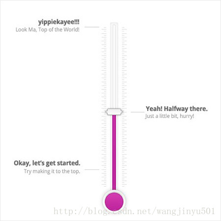
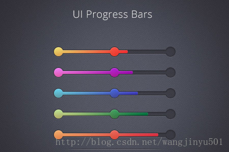
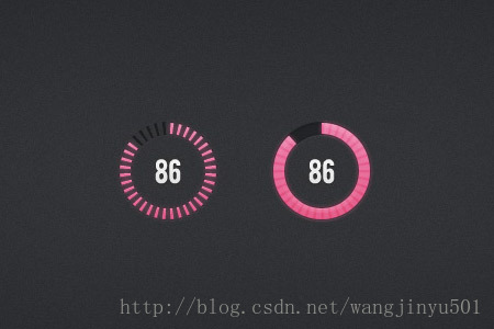
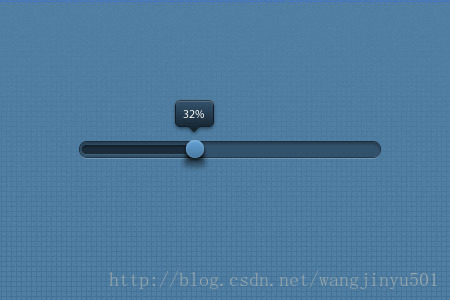
今回は主にAndroidの下でのプログレスバーについて、なぜそれなのか、最近その様々な美しいデザインに圧倒され、徐々に実装していく予定だからです。また、Viewクラスを直接継承する数少ないコントロールでもあり、そこからカスタムコントロールの知識をある程度身につけられることも要因の一つです。以下、参考までに私がかなり美しいと思うプログレスバーをいくつか挙げておきます。
美しいと思いませんか?実は、上の図にあるように、プログレスバーは一般的にこれらのフォームだけなのです。これでは間違いなくカスタマイズが必要なので、システムのProgressBarを継承するか、Viewクラスを継承する(前者の実装方法)かの2つの方向があります。そこで、まずシステムのプログレスバーを見てみましょう。
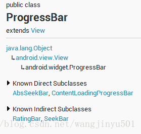
Viewクラスから継承した、直接のサブクラスはAbsSeekBarとContentLoadingProgressBarで、このうちAbsSeekBarのサブクラスはSeekBarとRatingBarで、これもProgressBarの実装が元になっています。ProgressBarの使用については、3箇所ほど注意が必要です。
1、ProgressBarは二つの進捗があり、一つはandroid:progress、もう一つはandroid:secondaryProgress、後者は主にキャッシュの必要性、例えば、ネットワークビデオを見るとき、キャッシュ進捗バーと再生進捗があり、ここでキャッシュ進捗はThe cache progress can be android:secondaryProgress, while the playback progress is android:progress.The progressはキャッシュ進捗はThe cache progress can be the android:secondaryProgress, playback progressは再生進捗はThe cache progress is android:progress.This progressはキャッシュ進捗はThe cache progressはThe cache progressはキャッシュ進捗はthe cache progressである。
2、ProgressBarは確定と不定に分けられ、上記の再生進捗とキャッシュは確定である。逆に不確定なものは、操作が完了するまでにどれくらいかかるかわからない、今回は不確定なProgressBarを使用する必要があります。これは、android:indeterminateというプロパティで制御します。trueに設定すると、ProgressBarは円形スクロールバーまたは水平スクロールバー(スタイルによって決定される)にすることができます。デフォルトでは、水平方向のプログレスバーであればOKです。
3. ProgressBarのスタイルを設定する方法は、実は2つあり、APIドキュメントでは以下のように説明されています。
- Widget.ProgressBar.Horizontalを指定します。
- ウィジェット.プログレスバー.スモール 小さい <大きい Widget.ProgressBar。 大 Widget.ProgressBar.Inverse(ウィジェットプログレスバーインバース
- ウィジェット.プログレスバー.スモール.インバース <インバース ウィジェットプログレスバー(大)逆引き
style="@android:style/Widget.ProgressBar.Small" のように使用します。もう一つの方法は、システムattrを使用することです。上記はシステムスタイルです:。
- style="?android:attr/progressBarStyle"
- style="?android:attr/progressBarStyleHorizontal"
- style="?android:attr/progressBarStyleInverse"
- style="?android:attr/progressBarStyleLarge"
- style="?android:attr/progressBarStyleLargeInverse"
- style="?android:attr/progressBarStyleSmall"
- style="?android:attr/progressBarStyleSmallInverse"
- style="?android:attr/progressBarStyleSmallTitle"
次にProgressBarの他の共通プロパティを見てみると
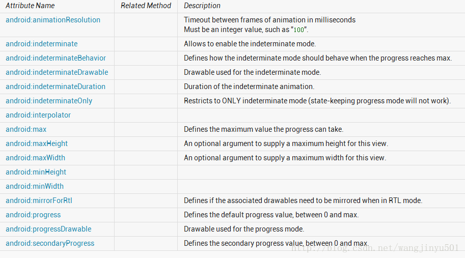
これらのプロパティの使い方はまだ比較的単純なので、紹介はしません。最初のandroid:animationResolutionは破棄されたので、気にしないでください。android:progressDrawableとandroid:indeterminateDrawableに注目し、このDrawableがProgressBarでどのように使われるのか、xmlでProgressBarをこのように設定すると。
   <ProgressBar
        android:id="@+id/progressbar"
        style="@android:style/Widget.ProgressBar.Horizontal"
        android:layout_width="match_parent"
        android:layout_height="wrap_content"
        android:secondaryProgress="50" />
    <style name="Widget.ProgressBar.Horizontal">
        <item name="android:indeterminateOnly">false</item>
        <item name="android:progressDrawable">@android:drawable/progress_horizontal</item>
        <item name="android:indeterminateDrawable">@android:drawable/progress_indeterminate_horizontal</item>
        <item name="android:minHeight">20dip</item>
        <item name="android:maxHeight">20dip</item>
        <item name="android:mirrorForRtl">true</item>
    </style>
まず、progress_horizontalを見てみましょう。ソースコードは以下の通りです。
<?xml version="1.0" encoding="utf-8"? >
<! -- Copyright (C) 2008 The Android Open Source Project

     Licensed under the Apache License, Version 2.0 (the "License");
     You may not use this file except in compliance with the License.
     You may obtain a copy of the License at

          http://www.apache.org/licenses/LICENSE-2.0

     Unless required by applicable law or agreed to in writing, software
     distributed under the License is distributed on an "AS IS" BASIS,
     unless required by applicable law or agreed to in writing, software distributed under the License is distributed on an "AS IS" BASIS, WITHOUT WARRANTIES OR CONDITIONS OF ANY KIND, either express or implied.
     See the License for the specific language governing permissions and
     See the License for the specific language governing permissions and limitations under the License.
-->

<layer-list xmlns:android="http://schemas.android.com/apk/res/android">

    <item android:id="@android:id/background">
        <shape>
            <corners android:radius="5dip" />
            <gradient
                    android:startColor="#ff9d9e9d"
                    android:centerColor="#ff5a5d5a"
                    android:centerY="0.75"
                    android:endColor="#ff747674"
                    android:angle="270"
            />
        </shape>
    </item>

    <item android:id="@android:id/secondaryProgress">
        <clip>
            <shape>
                <corners android:radius="5dip" />
                <gradient
ご覧のように、システムはレイヤーアプローチを使用してオーバーレイを行います。したがって、他のスタイルが必要な場合は、デフォルト値を変更するか、システム独自のスタイル設定を参照すればよい。
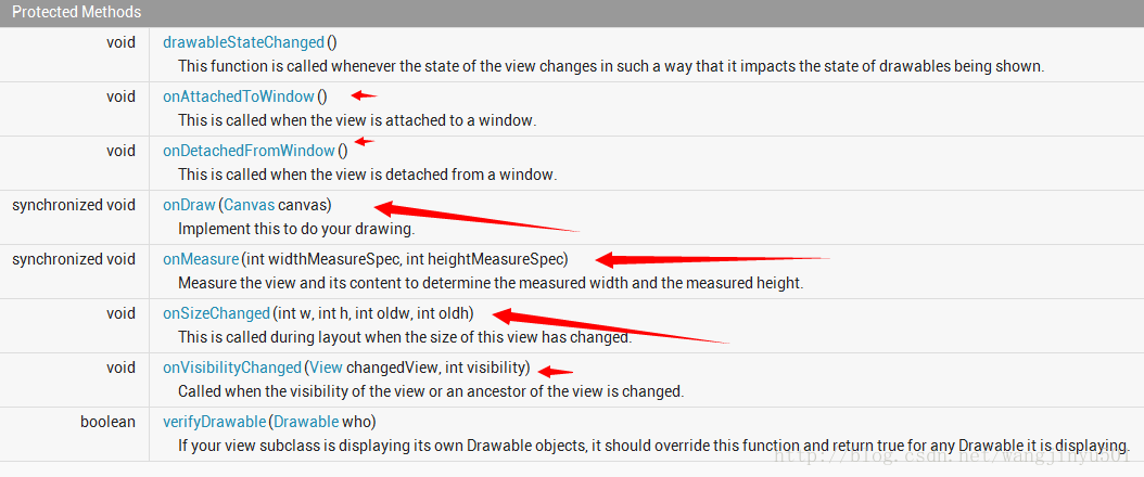
次に、ProgressBarのメソッドについて説明します。ひとつは、進捗状況の取得、進捗状況の最大値の設定、インサータの設定など、自身のプロパティに関連するものです。もうひとつは、図のような描画に関する部分です。
そこで、今回来た最も重要な部分、それは、美しいProgressBarをカスタマイズする方法です。カスタマイズの前に、まずシステムを見ると、どのように実現するかです。Android ProgressBarのコードの量は、コメントを除くと、数百行程度と推定され、多くはありません。まず、コンストラクタのメソッドから見ていきます。
  /**
     * Create a new progress bar with range 0... .100 and initial progress of 0.
     * @param context the application environment
     */
    public ProgressBar(Context context) {
        this(context, null);
    }

    public ProgressBar(Context context, AttributeSet attrs) {
        this(context, attrs, com.android.internal.R.attr.progressBarStyle);
    }

    public ProgressBar(Context context, AttributeSet attrs, int defStyle) {
        this(context, attrs, defStyle, 0);
    }

    /**
     * @hide
     */
    public ProgressBar(Context context, AttributeSet attrs, int defStyle, int styleRes) {
        super(context, attrs, defStyle);
        mUiThreadId = Thread.currentThread().getId();
        initProgressBar();

        TypedArray a =
            context.obtainStyledAttributes(attrs, R.styleable.ProgressBar, defStyle, styleRes);

        mNoInvalidate = true;

        Drawable drawable = a.getDrawable(R.styleable.ProgressBar_progressDrawable);
        if (drawable ! = null) {
            drawable = tileify(drawable, false);
            // Calling this method can set mMaxHeight, make sure the corresponding
            // XML attribute for mMaxHeight is read after calling this method
            setProgressDrawable(drawable);
        }


        mDuration = a.getInt(R.styleable.ProgressBar_indeterminateDuration, mDuration);

        mMinWidth = a.getDimensionPixelSize(R.styleable.ProgressBar_minWidth, mMinWidth);
        mMaxWidth = a.getDimensionPixelSize(R.styleable.ProgressBar_maxWidth, mMaxWidth). mMaxWidth = a.getDimensionPixelSize(R.styleable.ProgressBar_maxWidth, mMaxWidth);
        mMinHeight = a.getDimensionPixelSize(R.styleable.ProgressBar_minHeight, mMinHeight);
        mMaxHeight = a.getDimensionPixelSize(R.styleable.ProgressBar_maxHeight, mMaxHeight);

        mBehavior = a.getInt(R.styleable.ProgressBar_indeterminateBehavior, mBehavior);

        final int resID = a.getResourceId(
                com.android.internal.R.styleable.ProgressBar_interpolator,
                android.R.internal.R.styleable.ProgressBar_interpolator, android.R.anim. linear_interpolator); // default to linear interpolator
        if (resID > 0) {
            setInterpolator(context, resID);
        }

        setMax(a.getInt(R.styleable.ProgressBar_max, mMax));

        setProgress(a.getInt(R.styleable.ProgressBar_progress, mProgress));

        setSecondaryProgress(
                a.getInt(R.styleable.ProgressBar_secondaryProgress, mSecondaryProgress));

        drawable = a.getDrawable(R.styleable.ProgressBar_indeterminateDrawable);
        if (drawable ! = null) {
            drawable = tileifyIndeterminate(drawable);
            setIndeterminateDrawable(drawable);
        }

        mOnlyIndeterminate = a.getBoolean(
                R.styleable.ProgressBar_indeterminateOnly, mOnlyIndeterminate);

        mNoInvalidate = false;

        setIndeterminate( mOnlyIndeterminate || a.getBoolean(
                R.styleable.ProgressBar_indeterminate, mIndeterminate));

        mMirrorForRtl = a.getBoolean(R.styleable.ProgressBar_mirrorForRtl, mMirrorForRtl);

        a.recycle();
    }
R.styleable.Progre.
 <declare-styleable name="ProgressBar">
        <! -- Defines the maximum value the progress can take. -->
        <attr name="max" format="integer" />
        <! -- Defines the default progress value, between 0 and max. -->
        <attr name="progress" format="integer" />
        <! -- Defines the secondary progress value, between 0 and max.
             It can be ideal for media scenarios such as
             It can be ideal for media scenarios such as showing the buffering progress while the default progress shows the play progress;
        <attr name="secondaryProgress" format="integer" />
        <! -- Allows to enable the indeterminate mode.
         In this mode the progress bar plays an infinite looping animation;
        <attr name="indeterminate" format="boolean" />
        <! -- Restricts to ONLY indeterminate mode (state-keeping progress mode will not work). -->
        <attr name="indeterminateOnly" format="boolean" />
        <! -- Drawable used for the indeterminate mode. -->
        <attr name="indeterminateDrawable" format="reference" />
        <! -- Drawable used for the progress mode. -->
        <attr name="progressDrawable" format="reference" />
        <! -- Duration of the indeterminate animation. -->
        <attr name="indeterminateDuration" format="integer" min="1" />
        <! -- Defines how the indeterminate mode should behave when the progress
        reaches max. -->
        <attr name="indeterminateBehavior">
            <! --> <progress starts over from 0. -->
            <enum name="repeat" value="1" />
            <! -- Progress keeps the current value and goes back to 0. -->
            <enum name="cycle" value="2" />
        </attr>
        <attr name="minWidth" format="dimension" />
        <attr name="maxWidth" />
        <attr name="minHeight" format="dimension" />
        <attr name="maxHeight" />
        <attr name="interpolator" format="reference" />
        <! -- Timeout between frames of animation in milliseconds
             {@deprecated Not used by the framework.} -->
ProgressBarは3つのコンストラクタをすべてリストアップして再帰的に呼び出していますが、それぞれのコンストラクタで初期化コードを呼び出す方法もあり、こちらの方が形式的だと思います。次に3番目のコンストラクタを見てください。これは主に2つのことを行います。attrsファイルから設定されたプロパティを読み込み、initProgressBar()メソッドでProgressBarにいくつかのデフォルトのプロパティ値をセットします。
  private void initProgressBar() {
        mMax = 100;
        mProgress = 0;
        mSecondaryProgress = 0;
        mIndeterminate = false;
        mOnlyIndeterminate = false;
        mDuration = 4000. mBehavior = AlphaAnimation;
        mBehavior = AlphaAnimation;
        mMinWidth = 24;
        mMaxWidth = 48;
        mMinHeight = 24;
        mMaxHeight = 48. mMaxHeight = 48;
    }
これはデフォルトのプロパティ値です。これはカスタムViewの中で最も基本的なもので、多くを語る必要はありませんが、ここで注意すべきことが2つあります。1つはmUiThreadIdで、これは何をしているのでしょうか?これは現在のUIスレッドのidを取得し、ProgressBarの進捗を更新する際に、UIスレッドであれば直接更新し、そうでなければポストアウトしてHandlerなどを使って更新するという判断をしているのだそうです。次に、tileify(drawable, false)メソッドとtileifyIndeterminate(drawable)メソッドです。この二つのメソッドは、主にDrawableを解析して変換する処理である。ここで、ProgressBarの最も重要な部分はDrawableの使用であることを強調する必要がある。Progressを含むその背景だけでなく、Drawableを使って行われているので、ソースコードを見ると、基本的にコードの70〜80%がDrawableに関連していることが分かる。この部分の長さのために、我々はそれを詳細に紹介することはありませんので、次の焦点は、ProgressBarを描画する方法、最初にonMeasure()メソッドを見ると、そのようなものです。
 @Override
    protected synchronized void onMeasure( int widthMeasureSpec, int heightMeasureSpec) {
        Drawable d = mCurrentDrawable;

        int dw = 0;
        int dh = 0;
        if (d ! = null) { dw = Math.
            dw = Math. max(mMinWidth , Math.min( mMaxWidth, d.getIntrinsicWidth()));
            dh = Math. max(mMinHeight , Math.min( mMaxHeight, d.getIntrinsicHeight()));
        }
        updateDrawableState();
        dw += mPaddingLeft + mPaddingRight;
        dh += mPaddingTop + mPaddingBottom;

        setMeasuredDimension( resolveSizeAndState(dw, widthMeasureSpec, 0),
                resolveSizeAndState(dh, heightMeasureSpec, 0));
    }
通常の流れであれば、onLayout()メソッドを書き換えることを考える人もいるかもしれませんが、ここではProgressBarは単なるViewであり、位置を処理する必要はありません。そこで、直接、onDraw()メソッドを
 @Override
    protected synchronized void onDraw(Canvas canvas) {
        super.onDraw(canvas);

        Drawable d = mCurrentDrawable;
        if (d ! = null) {
            // Translate canvas so a indeterminate circular progress bar with padding
            // rotates properly in its animation
            canvas.save();
            if(isLayoutRtl() && mMirrorForRtl) {
                canvas.translate(getWidth() - mPaddingRight, mPaddingTop);
                canvas.scale(-1.0f, 1.0f);
            } else {
                canvas.translate(mPaddingLeft, mPaddingTop);
            }
            long time = getDrawingTime();
            if ( mHasAnimation) {
                mAnimation.getTransformation(time, mTransformation);
                float scale = mTransformation.getAlpha();
                try {
                    mInDrawing = true;
                    d.setLevel(( int) (scale * MAX_LEVEL));
                } finally {
                    mInDrawing = false;
                }
                postInvalidateOnAnimation();
            }
            d.draw(canvas);
            canvas.restore();
            if ( mShouldStartAnimationDrawable && d instanceof Animatable) {
                ((Animatable) d).start();
                mShouldStartAnimationDrawable = false ;
            }
        }
まず最初に、現在のDrawableオブジェクトを取得し、それが空でなければ描画を開始します。最初に、レイアウトの方向に応じてキャンバスを移動するための判定を行います。
  public boolean isLayoutRtl() {
        return (getLayoutDirection() == LAYOUT_DIRECTION_RTL);
    }
この LAYOUT_DIRECTION_RTL は、LayoutDirection の定数です。
package android.util;

/**
* A layout direction can be left-to-right (LTR) or right-to-left (RTL).
A layout direction can be left-to-right (LTR) * or right-to-left (RTL). It can also be inherited (from a parent) or deduced from the default
It can also be inherited (from a parent) or deduced from the default * language script of a locale.
*/It can also be inherited (from a parent) or deduced from the default * language script of a locale.
public final class LayoutDirection {

    // No instantiation
    private LayoutDirection() {}

    /**
     * Horizontal layout direction is from Left to Right.
     */
    public static final int LTR = 0;

    /**
     * Horizontal layout direction is from Right to Left.
     */
    public static final int RTL = 1;

    /**
     * Horizontal layout direction is inherited.
     */
    public static final int INHERIT = 2;

    /**
     * Horizontal layout direction is deduced from the default language script for the locale.
     */
    public static final int LOCALE = 3;
}
次に、アニメーションがあるかどうかを判断し、ある場合はViewクラスのpostInvalidateOnAnimation()メソッドを呼び出してアニメーションを実行します。最後にDrawableオブジェクトを呼び出してd.draw(canvas)で描画しています。
一般に、システムのProgressBarはDrawableと密接な関係があるので、もし我々のカスタムProgressBarがDrawableと関係があるなら、システムのProgressBarを継承して開発することができるだろう。カスタムProgressBarがDrawableとほとんど関係がない場合、例えば以下のようになります。

実はDrawableは必要なく、Viewクラスを直接継承して開発することが可能です。
次に、ProgressBarをカスタマイズする方法を2つ紹介します。
I. システムのProgressBarを継承する
まず、上であげたプログレスバーの一つである
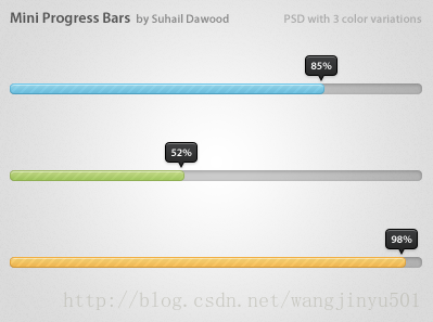
アイデア
Mini ProgressBarは、ネイティブのProgressBarにテキスト表示でインジケータを追加します。実装はこんな感じでしょうか。
つまり、カスタムProgressBarには2つの部分があり、1つはデフォルト、もう1つは新しく追加されたインジケータです。インジケータは、実際には Drawable とテキストを組み合わせたもので、システム ProgressBar の上に直接描画される。次に、Drawable、テキスト、間隔など、カスタムProgressBarのプロパティを定義する必要がある。そのため、attrsファイルはこのように書くことができる。
<?xml version= "1.0" encoding ="utf-8"? >
<resources>

    <declare-styleable >
        <attr name= "progressIndicator" format="reference" ></attr>
        <attr name= "offset" format = "dimension"></ attr>
        <attr name= "textSize" format ="dimension"></ attr>
        <attr name= "textColor" format="reference|color" ></attr>
        <attr name= "textStyle">
            <flag name= "normal" value ="0" />
            <flag name= "bold" value ="1" />
            <flag name= "italic" value ="2" />
        </attr>
        <attr name= "textAlign">
            <flag name= "left" value ="0" />
            <flag name= "center" value ="1" />
            <flag name= "right" value ="2" />
        </attr>
    </declare-styleable >

</resources>
ps: eclipseは文章を書くときにdeclare-styleableを自動的にプロンプトしないことがわかりました。
その後、ProgressBar を継承した新しいクラスを作成します。
/**
 * @author kince
 *
 */
public class IndicatorProgressBar extends ProgressBar {

     public IndicatorProgressBar(Context context) {
           this(context, null);

     }

     public IndicatorProgressBar(Context context, AttributeSet attrs) {
           this(context, attrs, 0);

     }

     public IndicatorProgressBar(Context context, AttributeSet attrs,
               int defStyle) {
           super(context, attrs, defStyle);

     }


}
次に、3番目のコンストラクタ・メソッドでデータを初期化します。textとDrawableを使うので、グローバル変数の宣言も必要で、初期化後のコードは次のようになります。
 /**
*
*/
package com.example.indicatorprogressbar.widget;

import com.example.indicatorprogressbar.widget; import com.example.indicatorprogressbar.R;

import android.content.Context;
import android.content.res.TypedArray;
import android.graphics.Color;
import android.graphics.Paint;
import android.graphics.Paint.Align;
import android.graphics.drawable;
import android.text.TextPaint;
import android.util.AttributeSet;
import android.widget.ProgressBar;

ProgressiveBar; /**
* @author kince
*
kince */
public class IndicatorProgressBar extends ProgressBar {


     private TextPaint mTextPaint;
     private Drawable mDrawableIndicator;
     private int offset=5;


     public IndicatorProgressBar(Context context) {
          this(context, null);

     }

     public IndicatorProgressBar(Context context, AttributeSet attrs) {
          this(context, attrs, 0);
          mTextPaint=new TextPaint(Paint.ANTI_ALIAS_FLAG);
          mTextPaint.density=getResources().getDisplayMetrics().density;

          mTextPaint.setColor(Color.WHITE);
          mTextPaint.setTextSize(10);
          mTextPaint.setTextAlign(Align.CENTER);
          mTextPaint.setFakeBoldText(true);
     }

     public IndicatorProgressBar(Context context, AttributeSet attrs,
               int defStyle) {
          super(context, attrs, defStyle);

          TypedArray array=context.obtainStyledAttributes(attrs, R.styleable.IndicatorProgressBar, defStyle, 0);
          if(array!=null){
               mDrawableIndicator=array.getDrawable(R.styleable.IndicatorProgressBar_progressIndicator);
               offset=array.getInt(R.styleable.IndicatorProgressBar_offset, 0);
               array.recycle();
          }

     }

}
そして、グローバル変数にsetメソッドとgetメソッドを設定し、プログラム内で簡単に呼び出せるようにします。
 public Drawable getmDrawableIndicator() {
           return mDrawableIndicator ;
     }

     public void setmDrawableIndicator(Drawable mDrawableIndicator) {
           this.mDrawableIndicator = mDrawableIndicator;
     }

     public int getOffset() {
           return offset ;
     }

     public void setOffset(int offset) {
           this.offset = offset;
     }
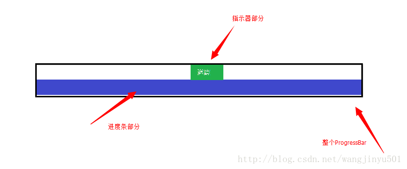
次に、onMeasure()メソッドとonDraw()メソッドをオーバーライドします。onMeasure() では、プログレスバーの具体的なサイズを計算する必要があります。上の図によると、プログレスバーの幅は、システムプログレスバーの幅と同じ、つまり getMeasuredWidth(); 高さは、インジケータが追加されるので、その高さに、システムのプログレスバーの高さを加えたものです。ですから、onMeasure()メソッドでは、次のように書けばよいのです。
	@Override
	protected synchronized void onMeasure(int widthMeasureSpec,
			int heightMeasureSpec) {
		// TODO Auto-generated method stub
		super.onMeasure(widthMeasureSpec, heightMeasureSpec);
		if(mDrawableIndicator!=null){
			//Get the width of the system progress bar This width is also the width of the custom progress bar so assign it directly here
			final int width=getMeasuredWidth();
			final int height=getMeasuredHeight()+getIndicatorHeight();
			setMeasuredDimension(width, height);
		}

	}

	/**
	 * @category Get the height of the indicator
	 * @return
	 */
	private int getIndicatorHeight(){
		if(mDrawableIndicator==null){
			return 0;
		}
		Rect r=mDrawableIndicator.copyBounds();
		int height=r.height();
		return height;
	}
続いて、onDraw()メソッドです。onMeasure()メソッドでプログレスバーの高さを上げているため、描画時にシステムプログレスバーとインジケータを分離する必要があります。プログレスバーのスタイルファイルでは、次のように設定します。
<style name="Widget.ProgressBar.RegularProgressBar">
        <item name="android:indeterminateOnly" >false </item>
        <item name="android:progressDrawable" >@drawable/progressbar </item>
        <item name="android:indeterminateDrawable" >@android:drawable/progress_indeterminate_horizontal </item>
        <item name= "android:minHeight">1dip</item >
        <item name= "android:maxHeight">10dip</item >
    </style >
android:progressDrawableのプロパティで、使用されているdrawableはこれです。
<layer-list xmlns:android="http://schemas.android.com/apk/res/android" >

    <item
        android:id="@android:id/background"
        android:drawable="@drawable/progressbar_bg" />
    <item
        android:id="@+id/progress"
        android:drawable="@drawable/progressbar_bar" >
    </item >
    <item android:id="@+id/pattern">
        <bitmap
            android:src="@drawable/progressbar_pattern"
            android:tileMode="repeat" />
    </item >

</layer-list>
 if (m_indicator ! = null) {
               if (progressDrawable ! = null
                        && progressDrawable instanceof LayerDrawable) {
                   LayerDrawable d = (LayerDrawable) progressDrawable;

                    for (int i = 0; i < d.getNumberOfLayers(); i++) {
                        d.getDrawable(i).getBounds(). top = getIndicatorHeight();
                        d.getDrawable(i).getBounds(). top = getIndicatorHeight(); d.getDrawable(i).getBounds(). bottom = d.getDrawable(i)
                                  .getBounds().height()
                                  + getIndicatorHeight();
                   }
              } else if (progressDrawable ! = null) {
                   progressDrawable.getBounds(). top = m_indicator
                             . getIntrinsicHeight();
                   progressDrawable.getBounds(). top = m_indicator .getIntrinsicHeight(); progressDrawable.getBounds(). bottom = progressDrawable
                             .getBounds().height() + getIndicatorHeight();
              }
          }
次に、プログレスバーの位置を更新する必要があります。
private void updateProgressBar () {
          Drawable progressDrawable = getProgressDrawable();

           if (progressDrawable ! = null
                   && progressDrawable instanceof LayerDrawable) {
              LayerDrawable d = (LayerDrawable) progressDrawable;

               final float scale = getScale(getProgress());

               // Get the progress bar and update its size
              Drawable progressBar = d.findDrawableByLayerId(R.id.progress );

               final int width = d.getBounds(). right - d.getBounds().left ;

               if (progressBar ! = null) {
                   Rect progressBarBounds = progressBar.getBounds(). right = progressBar.getBounds();
                   progressBarBounds. right = progressBarBounds.left
                             + ( int ) (width * scale + 0.5f);
                   progressBar.setBounds(progressBarBounds);
              }

               // Get the overlay layer
              Drawable patternOverlay = d.findDrawableByLayerId(R.id.pattern );

               if (patternOverlay ! = null) { if (patternOverlay !
                    if (progressBar ! = null) {
                         // Adapt the overlay layer to the progress bar size
                        Rect patternOverlayBounds = progressBar.copyBounds();
                         final int left = patternOverlayBounds.left ;
                         final int right = patternOverlayBounds.right ;

                        patternOverlayBounds. left = (left + 1 > right) ? left
                                  : left + 1;
                        patternOverlayBounds. right = (right > 0) ? right - 1
                                  : right;
                        patternOverlay.setBounds(patternOverlayBounds);
                   } else {
                         // no overlay layer
                        Rect patternOverlayBounds = patternOverlay.getBounds();
                        patternOverlayBounds. right = patternOverlayBounds.left
                                  + ( int ) (width * scale + 0.5f);
                        patternOverlay.setBounds(patternOverlayBounds);
                   }
              }
          }
     }
最後に、インジケータを描画する必要がある、その
if (m_indicator ! = null) {
              canvas.save();
               int dx = 0;

               // Get the rightmost position of the system progress bar, which is the position of the header
               if (progressDrawable ! = null
                        && progressDrawable instanceof LayerDrawable) {
                   LayerDrawable d = (LayerDrawable) progressDrawable;
                   Drawable progressBar = d.findDrawableByLayerId(R.id.progress );
                   dx = progressBar.getBounds(). right;
              } else if (progressDrawable ! = null) {
                   dx = progressDrawable.getBounds().right ;
              }

               // Add offset
              dx = dx - getIndicatorWidth() / 2 - m_offset + getPaddingLeft();

               // Move the brush position
              canvas.translate(dx, 0);
                                   // draw the indicator
               m_indicator .draw(canvas);
              // draw the progress numbers
              canvas.drawText(
                         m_formatter ! = null ? m_formatter .getText(getProgress())
                                  : Math.round(getScale(getProgress()) * 100.0f)
                                           + "%" , getIndicatorWidth() / 2,
                        getIndicatorHeight() / 2 + 1, m_textPaint );

               // restore canvas to original
              canvas.restore();
          }
Githubのアドレスです。 https://github.com/wangjinyu501/SaundProgressBar
関連
最新
-
nginxです。[emerg] 0.0.0.0:80 への bind() に失敗しました (98: アドレスは既に使用中です)
-
htmlページでギリシャ文字を使うには
-
ピュアhtml+cssでの要素読み込み効果
-
純粋なhtml + cssで五輪を実現するサンプルコード
-
ナビゲーションバー・ドロップダウンメニューのHTML+CSSサンプルコード
-
タイピング効果を実現するピュアhtml+css
-
htmlの選択ボックスのプレースホルダー作成に関する質問
-
html css3 伸縮しない 画像表示効果
-
トップナビゲーションバーメニュー作成用HTML+CSS
-
html+css 実装 サイバーパンク風ボタン
おすすめ
-
Android プロジェクトのライブラリに armeabi-v7a、armeabi、x86 が追加されました。
-
呼び出しは、ユーザーによって拒否される可能性のある許可を必要とします。
-
Error:タスク ':app:compileDebugJavaWithJavac' の実行に失敗しました。解決方法
-
障害発生 [INSTALL_FAILED_OLDER_SDK] 解決方法
-
Androidバージョン一覧
-
Android ListViewでaddHeaderを使用する
-
Android開発用アダプターシリーズ。カスタムアダプタを使ったスピナー
-
android.content.ActivityNotFoundException: Intenを処理するアクティビティが見つからない
-
android.content.res.Resources$NotFoundException: 文字列リソースID #0x1エラー
-
Android android-support-multidexを使用すると、Dexがメソッドの制限を超える問題を解決し、アプリケーションがバーストしなくなります。