Rマッピング
図面例
Rグラフクックブックの例
From.
http://www.dataguru.cn/article-1766-1.html
Today I suddenly found a book dedicated to teaching R graphing, R Graph Cookbook, and found it quite good. When I first liked the R language is because it is particularly good-looking drawing. The following is the content of this book, after I study, translate and post it. (My level is not enough, originality is not enough, but learning is the process of imitation and then innovation) The reason why I want to post it to my blog is that I am afraid that one day I will forget it, so I can search it directly to my blog, and it is also convenient for others.
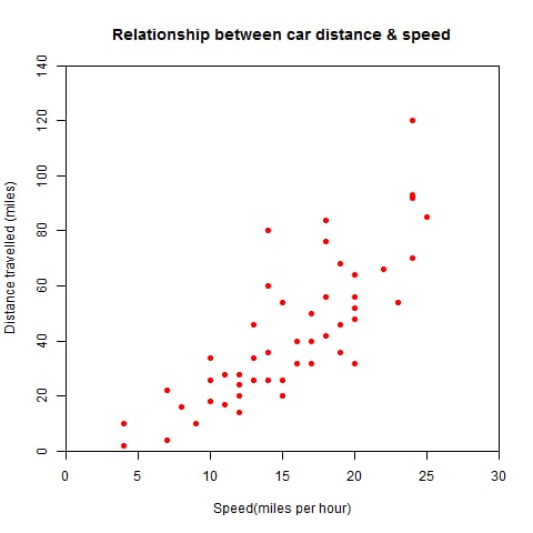
plot(cars$dist~cars$speed,#y~x, cars is the data that comes with R
main="Relationship between car distance & speed",# title
xlab = "Speed(miles per hour)",#x-axis title
ylab = "Distance travelled (miles)",#Y-axis header
xlim = c(0,30),# set the x-axis to take the value of the interval 0 to 30
ylim = c(0,140),# set the y-axis take the value of the interval of 0 to 140
xaxs = "i",# here is to set the style of the x-axis, temporarily did not see how much difference
yaxs = "i",
col = "red",# set the color
pch = 19)#pch refers to the shape of the dot, expressed in numbers, see the help file
#What if I want to save the image? I think the easiest way is to use RStudio, an IDE that is extremely good, but unfortunately many people do not know. # If you do not know, you can use the following code to achieve: # (there are many more parameters of the graphics, I only used a few of them here)
png(filename="scatterplot.png",width=480,height=480)
plot(cars$dist~cars$speed,#y~x
main="Relationship between car distance & speed",# title
xlab = "Speed(miles per hour)",#x axis title
ylab = "Distance travelled (miles)",#Y-axis header
xlim = c(0,30),# set the x-axis to take the value of the interval 0 to 30
ylim = c(0,140),# set the y-axis take the value of the interval of 0 to 140
xaxs = "i",# here is to set the style of the x-axis, temporarily did not see how much difference
yaxs = "i",
col = "red",
pch = 19)#pch refers to the shape of the point, expressed in numbers, see the help file
dev.off()
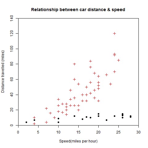
png(filename="scatterplot.png",width=480,height=480)
plot(cars$dist~cars$speed,#y~x
main="Relationship between car distance & speed",# title
xlab = "Speed(miles per hour)",#x axis title
ylab = "Distance travelled (miles)",#Y-axis header
xlim = c(0,30),# set the x-axis to take the value of the interval 0 to 30
ylim = c(0,140),# set the y-axis take the value of the interval of 0 to 140
xaxs = "i",# here is to set the style of the x-axis, temporarily did not see how much difference
yaxs = "i",
col = "red",
pch = 3)#pch refers to the shape of the point, expressed in numbers, see the help documentation
points (cars$speed~cars$dist,pch=19)# because it is difficult to get the data, the original data causality reversed, pch set different from the previous to distinguish
dev.off()
以下はRでの散布図についてですが、散布図はplot(x,y)を使えば簡単ですが、散布図は単純すぎるので、より美しいグラフにするために細かくパラメータを設定する必要があります。

<スパン
<スパン
<スパン
さっそく、コメントアウトしてあるコードを見てみましょう。
png(filename="scatterplot.png",width=480,height=480)
Sales <- read.csv("/home/rickey/documentation/eBooks/R Tutorials/Learn R statistics/R Graph/Code/Chapter 1/Data Files/citysales.csv",header=TRUE)# header set to TRUE means that the names of the rows and columns of data are also read in
barplot(Sales$ProductA,
names.arg=Sales$City,
col="blue")
dev.off()
#pdf("mygraph.pdf")#pdf file
win.metafile("filename.wmf")#windows graphics file
#png("filename.png")#PBG file
#jpeg("filename.jpg")#JPEG file
#bmp("filename.bmp")#BMP file
#postscript("filename.ps")#PostScript files
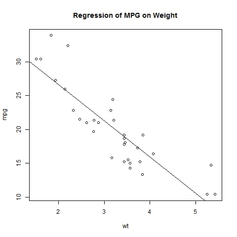
attach(mtcars)
plot(wt,mpg)
abline(lm(mpg~wt))
title("Regression of MPG on Weight")
detach(mtcars)
dev.off()
データがない場合は、data()を使ってR言語に組み込まれたデータを見ることができます。まだまだデータはたくさんあります。
<スパン これは散布図ですが、パラメータの中にtype="l"#とlの文字を入れるだけで、直列の点を線として描画してくれます。
<スパン ここでは、本に付属しているデータを使って、以下のようなコードで、棒グラフ(バープロット)を描きます。
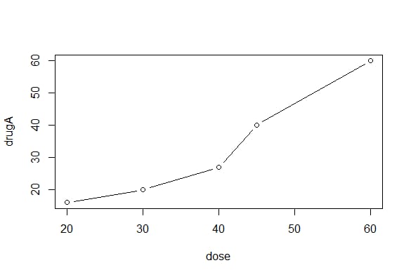
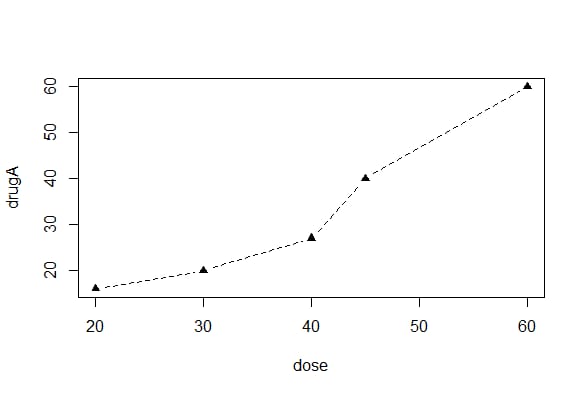
dose=c(20,30,40,45,60)
drugA=c(16,20,27,40,60)
drugB=c(15,18,25,31,40)
plot(dose,drugA,type="b")
dose=c(20,30,40,45,60)
drugA=c(16,20,27,40,60)
drugB=c(15,18,25,31,40)
plot(dose,drugA,type="b")
opar = par(no.readonly=TRUE) # copy a single sign of the graph parameters
par(lty=2,pch=17) #modify the default linear type to dashed (lty=2) and change the default dot symbol to a solid triangle (pch=17)
# can also use par(lty=2);par(pch=17) two sentences
plot(dose,drugA,type="b")#plotted graph
par(opar)# restores the original settings
# or write plot(dose,drugA,type="b",lty=2,pch=17) like this to draw the graph, but only for this graph
グラフィック出力(pdfWinPBG↵JPEG↵PostScript)
<スパン グラフィックをコードで保存するには、ターゲットグラフィックデバイスをオンにするステートメントとターゲットグラフィックデバイスをオフにするステートメントの間に、描画ステートメントを挟むだけです。
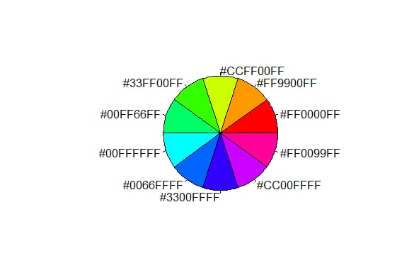
n=10
mycolors=rainbow(n)
pie(rep(1,n),labels=mycolors,col=mycolors)
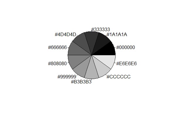
mygrays=gray(0:n/n)
pie(rep(1,n),labels=mygrays,col=mygrays)
<スパン
グラフィックス入門
グラフィックを使う
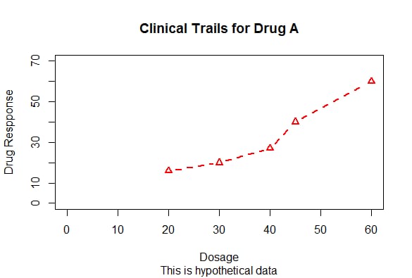
dose=c(20,30,40,45,60)
drugA=c(16,20,27,40,60)
drugB=c(15,18,25,31,40)
plot(dose,drugA,type="b",col="red",lty=2,pch=2,lwd=2,main="Clinical Trails for Drug A",sub="This is hypothetical data",xlab="Dosage",ylab="Drug Respponse",xlim=c(0,60),ylim=c(0,70))
5. グラフィックパラメータ
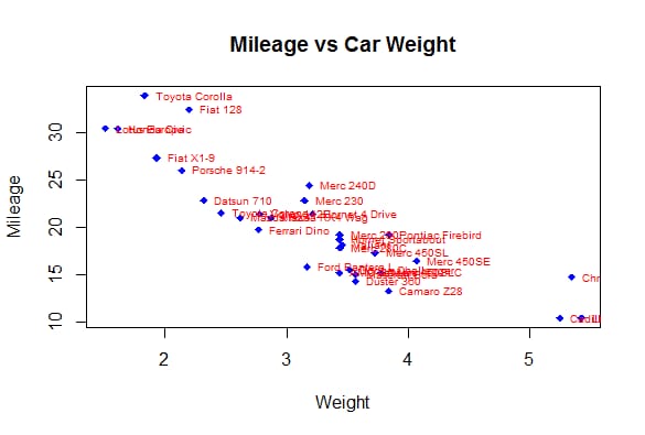
attach(mtcars)
plot(wt,mpg,main="Mileage vs Car Weight",xlab="Weight",ylab="Mileage",pch=18,col="blue")
text(wt,mpg,row.names(mtcars),cex=0.6,pos=4,col="red")
detach(mtcars)
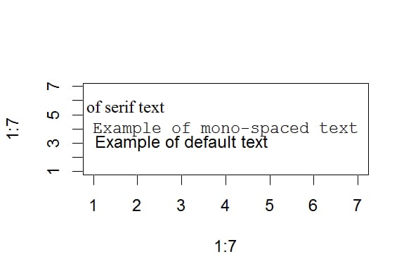
opar=par(no.readonly=TRUE)
par(cex=1.5)
plot(1:7,1:7,type="n")
text(3,3,"Example of default text")
text(4,4,family="mono","Example of mono-spaced text")
text(5.5,family="serif","Example of serif text")
par(opar)
pch :ポイント描画時に使用するシンボルを指定します。
cex : シンボルの大きさを指定します。cex はデフォルトサイズに対して描画シンボルをどれだけ拡大縮小するかを示す数値です。デフォルトのサイズは 1,1.5 であり、これはデフォルト値の 1.5 倍に拡大縮小されることを意味します。
lty: 線種を指定します。
lwd:線幅を指定します。(デフォルト値の数倍)
col: デフォルトの描画色。例えば、これは col=c("red","blue") で、1本目を赤、2本目を青、3本目を赤で3本の線を引く必要があります。
col.axis 座標軸の色
col.mainヘッダーの色
col.sub 小見出しの色
fgフォアグラウンドビュー
bg 背景色
例: col=1,col="white" col="#FFFFFF" col=rgb(1,1,1) col=hsv(0,1,1) 共に白の場合
また、連続色ベクトルを作成するための様々な関数がRで使用されています。
レインボー()
heat.colors()
地形.色()
top.colors()
cm.colors()
gray() は、グレースケールの複数のセクションを生成することができます。
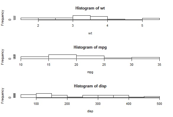
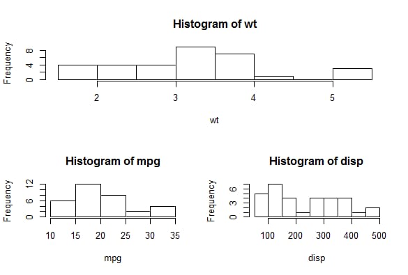
attach(mtcars)
opar=par(no.readonly=TRUE)
par(mfrow=c(3,1))
hist(wt)
hist(mpg)
hist(disp)
par(opar)
detach(mtcars)
<イグ
6. テキスト属性
cex: 相対的なデフォルトサイズのスケーリング倍率を示す値。(倍率)
cex.axis: 軸スケール・テキストのスケーリング乗数。
cex.lab: 軸ラベル(名前)のスケーリング乗数。
cex.main: タイトルのスケーリング倍率
cex.sub: サブヘッダーのスケーリング
font: 整数型。1=regular、2=bold、3=italic、4=bold italic、5=symbolic font (adobe エンコーディング)。
font.axis font.lab font.main font.sub
ps パウンドテキストの最終サイズは ps*cex です。
family テキストの描画に使用するフォントファミリです。標準値はserif(セリフ)、sans(サンセリフ)、mono(等幅)である
Windowsでは、関数windowsFont()で新しいマッピングを作成することができます。(Macでは、quartzFont()を使用します)
PDFやPostScript出力形式のグラフィックは、比較的簡単に修正することができます。
PDF は names(pdfFonts()) を使ってシステムで利用できるフォントを調べ、pdf(file="myplot.pdf",family="fontname") でグラフィックスを生成しています。
グラフィックのポストスクリプト出力形式は、names(postscriptFonts())とpostscript(file="myplot.ps",family="fontname")で行うことができます。
7. グラフサイズと枠の大きさ
ピン:グラフィック寸法(インチ)(幅と高さ
mai: 数値ベクトルによるボーダーのサイズ、インチ単位で "下、左、上、右" の順
mar: 数値ベクトルでの境界の大きさ、"下、左、上、右"の順で、小数単位。Default=c(5,4,4,2)+0.1
8. テキスト、カスタム座標、凡例の追加
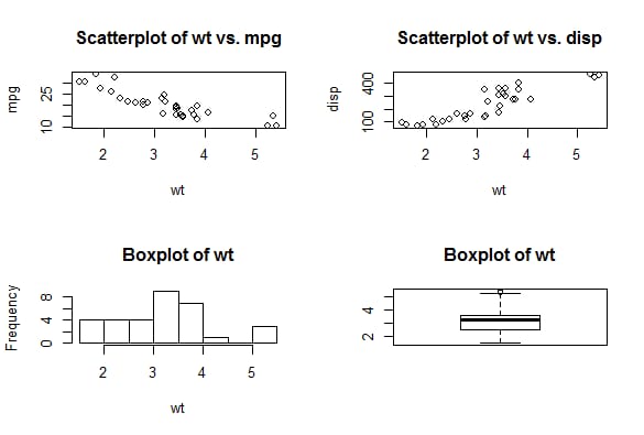
attach(mtcars)
opar= par(no.readonly=TRUE)
par(mfrow=c(2,2))
plot(wt,mpg,main="Scatterplot of wt vs. mpg")
plot(wt,disp,main="Scatterplot of wt vs. disp")
hist(wt,main="Boxplot of wt")
boxplot(wt,main="Boxplot of wt")
par(opar)
detach(mtcars)
いくつかの高度なプロット関数は、すでにデフォルトのタイトルとラベルを含んでいます。これらは、plot() 文の中の別の par() 文に ann=FALSE を追加することによって削除することができます。
タイトル
title()関数を使用すると、グラフにタイトルと軸ラベルを追加することができます。
座標軸
side: 座標が描かれるグラフの辺を示す整数(1,2,3,4は下、左、上、右に対応します。)
at: 目盛りが描かれる必要がある場所を示す数値ベクトル
labels: スケールの隣にあるフルテキストテーブルを示す文字ベクトル (NULL の場合、at の値を直接使用します)
pos: 軸の位置の座標
lty: 線の種類
col: 線の目盛りの色
las: ラベルが軸に平行 (=0) か垂直 (=2) かを指定します。
tck: プロットされた領域のサイズに対する割合で表されるスケールの長さ (負の数はグラフの外側に、整数は内側に) )
Hmiscパッケージのminor.tick()関数は、二次目盛りの作成に使用します。
tick.ratioは、主ティックに対する副ティックの大きさの比率を表します。現在の一次ティックの長さは par("tck") で取得することができます。
基準線
abline()関数を使うと、グラフに参照線を入れることができます。 abline(h=yvalues,v=xvalues)
例:abline(v=seq(1,10,2),ty=2,col="blue")。
図の凡例
<スパン 凡例を使う(位置、タイトル、凡例、...) 凡例を追加する
location: xy 値を直接与えることができる; location (1) はマウスクリックによる凡例の位置を与える; キーワード: bottom, bottomleft, left, topleft, toright, right, bottomright, center, また、パラメータ inset= を使って、グラフが移動したい内側のサイズ (プロットサイズに対する割合として表現) を指定します。
title: 凡例のタイトルを表す文字列(オプション)
legend: 凡例ラベルを構成する文字型のベクトル
<スパン
テキストマークアップ
テキスト (位置, "", 位置...)
mtext("", サイド, line=n...)
location: xyの値を直接与えることができる; location (1) はマウスクリックによる凡例の位置を与える
pose: 整数、テキストの相対位置の方向パラメータ。パラメータ offset=,,がオフセットとして指定された場合、一文字の幅に対する比率で表現されます。
side: テキストを配置する側を指定する整数値。
par() はフォントサイズを大きくします。
plotmath() 数式マークアップ
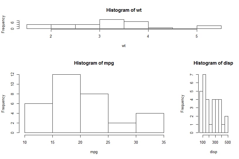
attach(mtcars)
layout(matrix(c(1,1,2,3),2,2,byrow=TRUE))
hist(wt)
hist(mpg)
hist(disp)
detach(mtcar)
<スパン
attach(mtcars)
layout(matrix(c(1,1,2,3),2,2,byrow=TRUE),widths=c(3,1),heights=c(1,2))
hist(wt)
hist(mpg)
hist(disp)
detach(mtcars)
<スパン
グラフィックスに問題があります
グラフィックの組み合わせ
R の関数 par() や layout() を用いると,複数のグラフを一つのグラフに簡単にまとめることができます. par() 関数は,グラフパラメータ mfrow=c(nrows,ncols) を用いて,行が nrows, 列が ncols で埋まるグラフ行列に糸を引きます.また、nfcols=c(nrows,ncols) を使用すると、行列を列で埋めることができます。
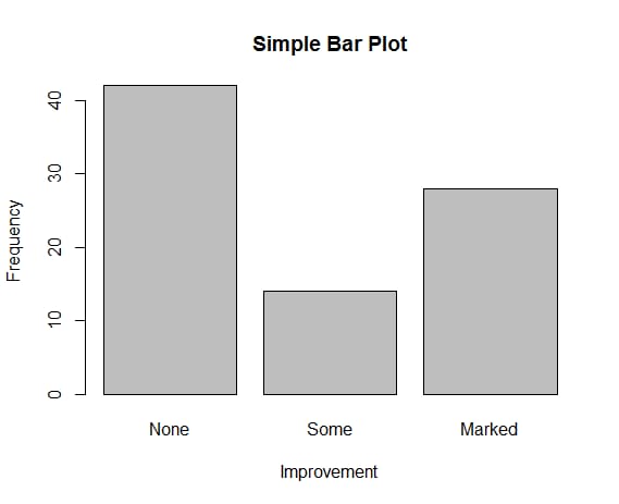
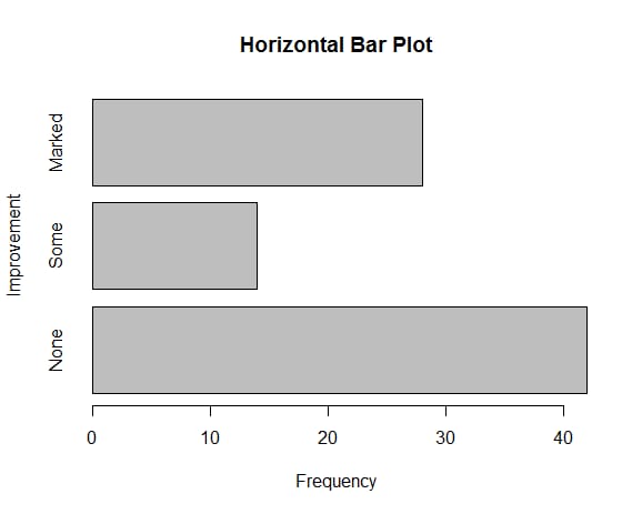
library(vcd)
counts=table(Arthritis$Improved)
counts
 barplot(counts,main="Simple Bar Plot",xlab="Improvement",ylab="Frequency")
barplot(counts,main="Horizontal Bar Plot",xlab="Frequency",ylab="Improvement",horiz=TRUE)
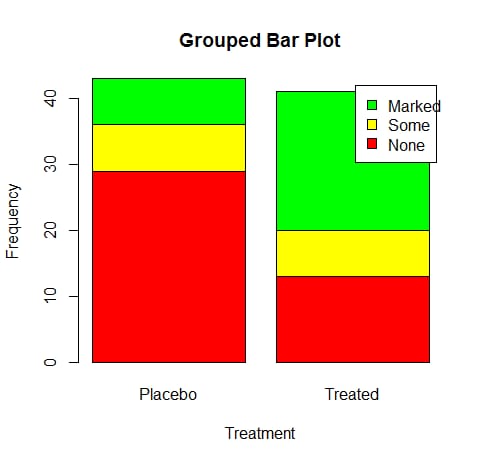
counts=table(Arthritis$Improved,Arthritis$Treatment)
counts

 # Placebo Treated
 # None 29 13
 # Some 7 7
 # Marked 7 21
barplot(counts,main="Grouped Bar Plot",xlab="Treatment",ylab="Frequency",col=c("red"," yellow","green"),legend=rownames(counts))


 barplot(counts,main="Grouped Bar Plot",xlab="Treatment",ylab="Frequency",col=c("red"," yellow","green"),legend=rownames(counts),beside=TRUE)
layout()関数の呼び出し状況はlayout(mat)であり、matは結合される複数の形状の位置を指定する行列である。
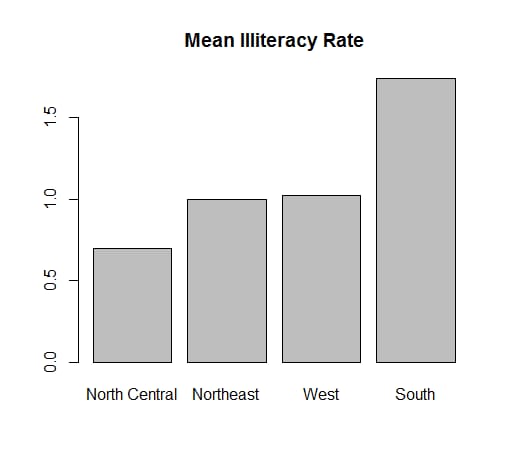
states=data.frame(state.region,state.x77)
means=aggregate(states$Illiteracy,by=list(state.region),FUN=mean)
means
# Group.1 x
#1 Northeast 1.000000
#2 South 1.737500
#3 North Central 0.700000
#4 West 1.023077
means=means[order(means$x),]
means
# Group.1 x
#3 North Central 0.700000
#1 Northeast 1.000000
#4 West 1.023077
#2 South 1.737500
barplot(means$x,names.arg=means$Group.1)
title("Mean Illiteracy Rate")
次のコードでは、1行目に1つ、2行目に2つの図形が配置されていますが、1行目の高さは2行目の図形の高さの3分の1、右下隅の図形の幅は左下隅の図形の幅の4分の1となっています。
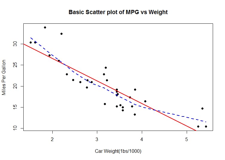
attach(mtcars)
plot(wt,mpg,main="Basic Scatter plot of MPG vs Weight",xlab="Car Weight(1bs/1000)",ylab="Miles Per Gallon ", pch=19)
abline(lm(mpg~wt),col="red",lwd=2,lty=1)
 lines(lowess(wt,mpg),col="blue",lwd=2,lty=2)
グラフィカルなレイアウトを自在にコントロール
fig=このタスクを完了する
基本グラフィック
棒グラフ
シンプルな棒グラフ
vcd パッケージ
プロットするカテゴリのタイプがFactorまたは順序付きFactorの場合、plot()関数を使用して縦棒グラフを素早く作成することができます。これは、table() 関数を使用せずに行われます。
(これは関節炎研究であり、Improvedという変数には、プラセボや薬を投与された各患者の治療効果が記録されている)
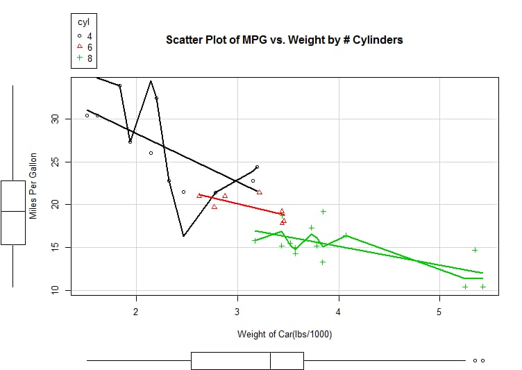
> library(car)
> scatterplot(mpg~wt|cyl,data=mtcars,lwd=2,main="Scatter Plot of MPG vs. Weight by # Cylinders",xlab="Weight of Car(lbs/ 1000)",ylab="Miles Per Gallon",legend.plot=TRUE,id.method="identify",labels=row.names(mtcars),boxplots=" quot;xy")
> library(car)
> scatterplot(mpg~wt|cyl,data=mtcars,lwd=2,main="Scatter Plot of MPG vs. Weight by # Cylinders",xlab="Weight of Car(lbs/ 1000)",ylab="Miles Per Gallon",legend.plot=TRUE,id.method="identify",labels=row.names(mtcars),boxplots=" quot;xy")
スタックバーとグループ化されたバー
heightがベクトルではなく行列の場合、結果は積み上げ棒グラフまたはグループ化されたプロボーションチャートになります。 besides=false (default)->stacked or not grouped bar chart
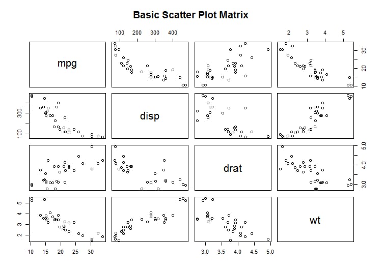
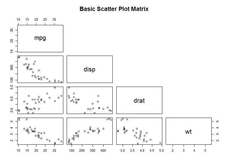
pairs(~mpg+disp+drat+wt,data=mtcars,main="Basic Scatter Plot Matrix")
<イグ
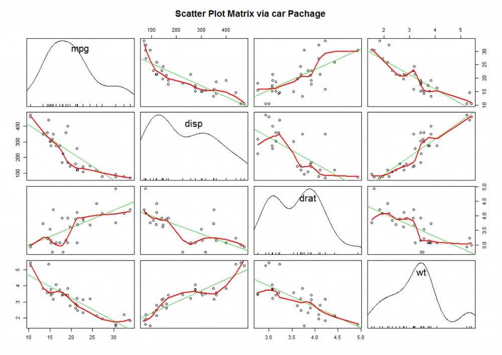
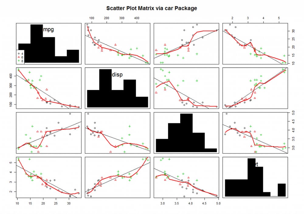
library(car)
scatterplotMatrix(~mpg+disp+drat+wt|cyl,data=mtcars,spread=FALSE,diagonal="histogram",main="Scatter Plot Matrix via car Package")
棒グラフの意味
<スパン 棒グラフは、カウントデータや頻度データに基づいている必要はありません。(平均値、中央値、標準偏差)。
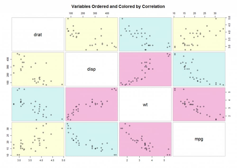
library(gclus)
mydata=mtcars[c(1,3,5,6)]
mydata.corr=abs(cor(mydata))
mycolors=dmat.color(mydata.corr)
myorder=order.single(mydata.corr)
cpairs(mydata,myorder,panel.colors=mycolors,gap=.5,main="Variables Ordered and Colored by Correlation")
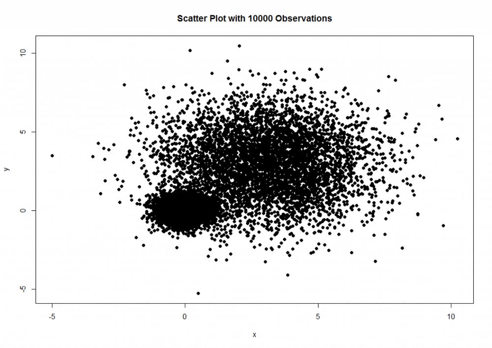
set.seed(1234)
n=10000
c1=matrix(rnorm(n,mean=0,sd=.5),ncol=2)
c2=matrix(rnorm(n,mean=3,sd=2),ncol=2)
mydata=rbind(c1,c2)
mydata=as.data.frame(mydata)
names(mydata)=c("x","y")
with(mydata,plot(x,y,pch=19,main="Scatter Plot with 10000 Observations"))

中級図面
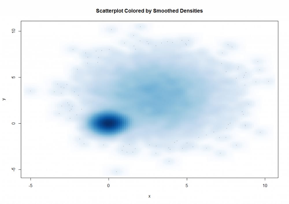
<スパン 散布図
with(mydata,smoothScatter(x,y,main="Scatterplot Colored by Smoothed Densities"))
KernSmooth 2.23 loaded
Copyright M. P. Wand 1997-2009
library(hexbin)
with(mydata,{
bin=hexbin(x,y,xbins=50)
plot(bin,main="Hexagonal Binning with 10000 Observations")
})
散布図マトリックス
library(scatterplot3d)
attach(mtcars)
scatterplot3d(wt,disp,mpg,pch=16,highlight.3d=TRUE,type="h",main="Basic 3D Scatter Plot")


fit=lm(mpg~wt+disp)
s3d$plane3d(fit)
attach(mtcars)
r=sqrt(disp/pi)
symbols(wt,mpg,circle=r,inches=0.30,fg="white",bg="lightblue",main="Bubble Plot with point size proportional to displacement",ylab="Miles Per Gallon",xlab="Weight of Car(lbs/1000)")
text(wt,mpg,rownames(mtcars),cex=0.6)
detach(mtcars)
<スパン
mpg wt disp drat
mpg 1.0000000 -0.8676594 -0.8475514 0.6811719
wt <スパン -0.8676594 1.0000000 0.8879799 -0.7124406
ディスプレー -0.8475514 <スパン 0.8879799 1.0000000 -0.7102139
ドレッド <スパン 0.6811719 -0.7124406 -0.7102139 1.0000000
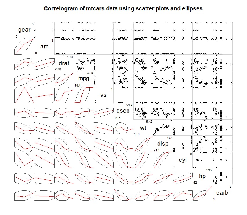
library(corrgram)
corrgram(mtcars,order=TRUE,lower.panel=panel.shade,upper.panel=panel.pie,text.panel=panel.txt,main="Correlogram of mtcars intercorrelations")
corrgram(mtcars,order=TRUE,lower.panel=panel.ellipse,upper.panel=panel.pts,text.panel=panel.txt,diag.panel=panel.minmax,main=" ;Correlogram of mtcars data using scatter plots and ellipses")
<スパン
hexbin パッケージの hexbin() 関数は、二項変数のエンベロープを六角形のセルに入れます(名前よりグラフの方が直感的です)。
corrgram(mtcars,lower.panel=panel.shade,upper.panel=NULL,text.panel=panel.txt,main="Car Mileage Data(unsorted)")
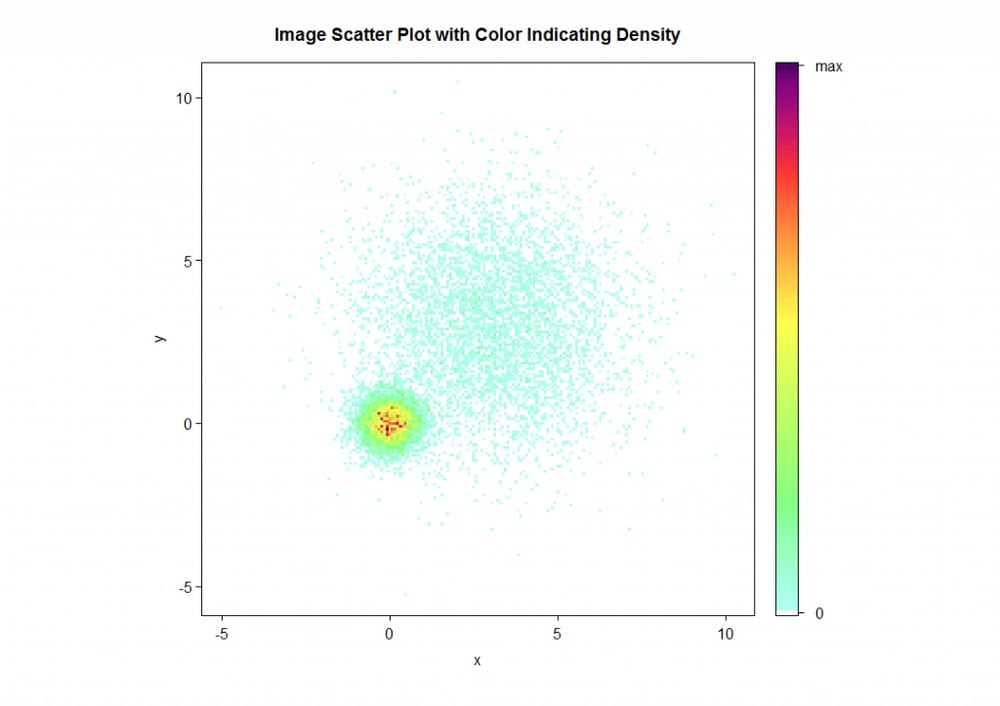
IDPmiscパッケージのiplot()関数では、ストアの密度(ある地点のデータ数)を色で表示することもできます。
with(mydata,iplot(x,y,main="Image Scatter Plot with Color Indicating Density")))
三次元散布図
library(scatterplot3d)
attach(mtcars)
scatterplot3d(wt,disp,mpg,pch=16,highlight.3d=TRUE,type="h",main="Basic 3D Scatter Plot")
fit=lm(mpg~wt+disp)
s3d$plane3d(fit)
バブルチャート
attach(mtcars)
r=sqrt(disp/pi)
symbols(wt,mpg,circle=r,inches=0.30,fg="white",bg="lightblue",main="Bubble Plot with point size proportional to displacement",ylab="Miles Per Gallon",xlab="Weight of Car(lbs/1000)")
text(wt,mpg,rownames(mtcars),cex=0.6)
detach(mtcars)
折线图
関連グラフ
> cor(mtcars)
mpg cyl disp hp drat wt qsec vs am
mpg 1.00 -0.85 -0.78 0.681 -0.87 0.419 0.66 0.600
シリンダー -0.85 1.00 0.90 0.83 -0.700 0.78 -0.591 -0.81 -0.523
ディスプ -0.85 0.90 1.00 0.79 -0.710 0.89 -0.434 -0.71 -0.591
HP -0.78 0.83 0.79 1.00 -0.449 0.66 -0.708 -0.72 -0.243
DRAT 0.68 -0.70 -0.71 -0.45 1.000 -0.71 0.091 0.44 0.713
WT -0.87 0.78 0.89 0.66 -0.712 1.00 -0.175 -0.55 -0.692
qsec 0.42 -0.59 -0.43 -0.71 0.091 -0.17 1.000 0.74 -0.230
vs 0.66 -0.81 -0.71 -0.72 0.440 -0.55 0.745 1.00 0.168
AM 0.60 -0.52 -0.59 -0.24 0.713 -0.69 -0.230 0.17 1.000
ギア 0.48 -0.49 -0.56 -0.13 0.700 -0.58 -0.213 0.21 0.794
キャブ -0.55 0.53 0.39 0.75 -0.091 0.43 -0.656 -0.57 0.058
ギアキャブ
mpg 0.48 -0.551
シリンダー -0.49 0.527
ディスプ -0.56 0.395
HP -0.13 0.750
ドラム缶 0.70 -0.091
WT -0.58 0.428
qsec -0.21 -0.656
vs 0.21 -0.570
am 0.79 0.058
ギア 1.00 0.274
キャブ 0.27 1.000
library(corrgram)
corrgram(mtcars,order=TRUE,lower.panel=panel.shade,upper.panel=panel.pie,text.panel=panel.txt,main="Correlogram of mtcars intercorrelations")
corrgram(mtcars,order=TRUE,lower.panel=panel.ellipse,upper.panel=panel.pts,text.panel=panel.txt,diag.panel=panel.minmax,main=" ;Correlogram of mtcars data using scatter plots and ellipses")
corrgram(mtcars,lower.panel=panel.shade,upper.panel=NULL,text.panel=panel.txt,main="Car Mileage Data(unsorted)")
<スパン モザイクチャート
再掲載元:http://blog.csdn.net/disappearedgod/article/details/8681312
最新
-
nginxです。[emerg] 0.0.0.0:80 への bind() に失敗しました (98: アドレスは既に使用中です)
-
htmlページでギリシャ文字を使うには
-
ピュアhtml+cssでの要素読み込み効果
-
純粋なhtml + cssで五輪を実現するサンプルコード
-
ナビゲーションバー・ドロップダウンメニューのHTML+CSSサンプルコード
-
タイピング効果を実現するピュアhtml+css
-
htmlの選択ボックスのプレースホルダー作成に関する質問
-
html css3 伸縮しない 画像表示効果
-
トップナビゲーションバーメニュー作成用HTML+CSS
-
html+css 実装 サイバーパンク風ボタン
おすすめ
-
ハートビート・エフェクトのためのHTML+CSS
-
HTML ホテル フォームによるフィルタリング
-
HTML+cssのボックスモデル例(円、半円など)「border-radius」使いやすい
-
HTMLテーブルのテーブル分割とマージ(colspan, rowspan)
-
ランダム・ネームドロッパーを実装するためのhtmlサンプルコード
-
Html階層型ボックスシャドウ効果サンプルコード
-
QQの一時的なダイアログボックスをポップアップし、友人を追加せずにオンラインで話す効果を達成する方法
-
sublime / vscodeショートカットHTMLコード生成の実装
-
HTMLページを縮小した後にスクロールバーを表示するサンプルコード
-
html のリストボックス、テキストフィールド、ファイルフィールドのコード例