Androidアプリ】【形状利用概要
Androidアプリケーションの開発では、様々な形状を定義するためにShapeを使用することが多い。
まず、Shapeの下にどのようなタグがあり、それが何を意味するのかを理解しましょう。
ソリッド:フィル
android:カラー
塗りつぶしの色を指定する
グラデーション: グラデーション
android:startColor と android:endColor はそれぞれ開始と終了の色です。
android:angleはグラデーションの角度です。
は45の整数倍でなければなりません。
.
また、グラデーションのデフォルトモードは android:type="linear" 、つまり線形グラデーションです。
android:type="radial" で放射状グラデーションを指定できます。放射状グラデーションは、半径を指定する必要があります android:gradientRadius="50".
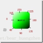
角度の値は、以下の位置に対応する。
ストローク:ストローク
android:width="2dp" はストロークの幅、android:color はストロークの色です。
と設定することで、ストロークを破線にすることもできます。
android:dashWidth="5dp"
android:dashGap="3dp"
android:dashWidthは'-'のような横線の幅、android:dashGapは'-'と'-'の間の距離を示しています。
角:丸みを帯びた角
android:radiusはコーナーの半径で、値が大きいほどコーナーが丸くなります。
また、四隅を異なる角度に設定することで、その
5つの属性を同時に設定すると、Radius属性が無効になる
android:Radius="20dp" は、四隅の半径を設定します。
android:topLeftRadius="20dp" 左上隅の半径を設定します。
android:topRightRadius="20dp" 右上隅の半径を設定します。
android:bottomLeftRadius="20dp" 右下隅の半径を設定します。
android:bottomRightRadius="20dp" 左下隅の半径を設定します。
padding: スペーシング
4方向にスペーシングを設定することができます
ここでは、簡単な例として ShapDemo を見てみましょう。まず、drawable フォルダの下に 2 つの xml ファイルを定義します。
button_bg.xmlの中身は以下の通りです。
<?xml version="1.0" encoding="utf-8"? >
<shape xmlns:android="http://schemas.android.com/apk/res/android" >

    <! -- fill -->
    <solid android:color="#ff9d77" /> <! -- Defines the color value of the fill -->

    <! -- Stroke -->
    <stroke
        android:width="2dp"
        android:color="#fad3cf" /> <! -- Define the width of the stroke and the color value of the stroke -->

	<! -- Rounded corners -->
    <corners
        android:bottomLeftRadius="5dp"
        android:bottomRightRadius="5dp"
        android:topLeftRadius="5dp"
        android:topRightRadius="5dp" /> <! -- Set the radius of the four corners -->

  	<! -- Spacing -->
    <padding
        android:bottom="10dp"
        android:left="10dp"
        android:right="10dp"
        android:top="10dp" /> <! -- Set the spacing in each direction -->

</shape>
button_pressed_bg.xmlの内容は以下のとおりです。
<?xml version="1.0" encoding="utf-8"? >
<shape xmlns:android="http://schemas.android.com/apk/res/android" >

    <! --gradient -->
    <gradient
        android:endColor="#FFFFFF"
        android:gradientRadius="50"
        android:startColor="#ff8c00"
        android:type="radial" />

    <! -- Stroke -->
    <stroke
        android:dashGap="3dp"
        android:dashWidth="5dp"
        android:width="2dp"
        android:color="#dcdcdc" />

    <! -- rounded corners -->
    <corners android:radius="5dp" />

    <! -- spacing -->
    <padding
        android:bottom="10dp"
        android:left="10dp"
        android:right="10dp"
        android:top="10dp" />

</shape>
ここで一つ注意点ですが、dashパラメータはstrokeの内側に設定されているので、グラフの端は破線になります。
drawable フォルダにセレクタ selectorbutton.xml ファイルを追加し、以下の内容を記述します。
<?xml version="1.0" encoding="utf-8"? >
<selector xmlns:android="http://schemas.android.com/apk/res/android">

    <item android:drawable="@drawable/button_pressed_bg" android:state_pressed="true"></item>
    <item android:drawable="@drawable/button_bg"></item>

</selector>
このファイルの意味は前述したとおりで、normalはbutton_bg、pressedはbutton_pressed_bgを表示します。
layoutディレクトリにあるactivity_main.xmlの内容を見てみましょう。
<RelativeLayout xmlns:android="http://schemas.android.com/apk/res/android"
    xmlns:tools="http://schemas.android.com/tools"
    android:layout_width="match_parent"
    android:layout_height="match_parent" >

    <Button
        android:layout_width="wrap_content"
        android:layout_height="wrap_content"
        android:background="@drawable/button"
        android:text="TestShapeButton" />

</RelativeLayout>
drawable フォルダにある button.xml に直接背景を指定します。
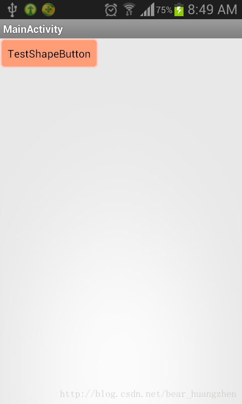
プログラムを実行した画面は以下の通りです。
プロジェクトのソースコード例を以下に添付します。
関連
-
Android Studio 3.1.2 新規プロジェクトのエラー AAPT2エラー:詳細はログを確認してください(Gradle 3.1.2)
-
android studio3.2 a pitfall: リソースの処理に失敗しました。詳細は上記の aapt の出力を参照してください。
-
ADBサーバーがACKしない問題を解決 (pro-test)
-
Error:タスク ':app:compileDebugJavaWithJavac' の実行に失敗しました。解決方法
-
Jniエラー:構造体でも組合でもないものにメンバー 'FindClass' を要求する、 解決方法
-
Android eclipseが起動できない:選択項目を起動できず、最近起動した項目もない
-
アンドロイドのdrawableフォルダ配下の各種xmlスタイルファイルの使用方法について詳しく解説しています
-
Android android-support-multidexを使用すると、Dexがメソッドの制限を超える問題を解決し、アプリケーションがバーストしなくなります。
-
AndroidManifestの使用機能の設定
-
React Native エラー。アプリケーション XXX は登録されていません ソリューション
最新
-
nginxです。[emerg] 0.0.0.0:80 への bind() に失敗しました (98: アドレスは既に使用中です)
-
htmlページでギリシャ文字を使うには
-
ピュアhtml+cssでの要素読み込み効果
-
純粋なhtml + cssで五輪を実現するサンプルコード
-
ナビゲーションバー・ドロップダウンメニューのHTML+CSSサンプルコード
-
タイピング効果を実現するピュアhtml+css
-
htmlの選択ボックスのプレースホルダー作成に関する質問
-
html css3 伸縮しない 画像表示効果
-
トップナビゲーションバーメニュー作成用HTML+CSS
-
html+css 実装 サイバーパンク風ボタン
おすすめ
-
[android.os.NetworkOnMainThreadException を解決してください。
-
Android プロジェクト コンパイル時に com.android.builder.internal.aapt.v2.Aapt2Exception に遭遇しました。AAPT2 エラー: 詳細はログを確認してください。
-
アンドロイド アルメアビ アルメアビ-v7a
-
AndroidStudioは、新しいプロジェクト:エミュレータを作成した後、エラーを報告します。ERROR: x86 emulation currently requires hardware acceleration!
-
エラーの報告です。ArrayAdapter は、リソース ID が TextView である必要があります。
-
adb push 権限拒否の解決策
-
Appiumチュートリアル_Android
-
Android マルチメディア MediaPlayerの使用方法詳細
-
Android動的ブロードキャストの追加許可
-
android.view.inflateexception バイナリ xml ファイル行例外の解決方法